
Want to create or adapt books like this? Learn more about how Pressbooks supports open publishing practices.

13.1 Formatting a Research Paper
Learning objectives.
- Identify the major components of a research paper written using American Psychological Association (APA) style.
- Apply general APA style and formatting conventions in a research paper.
In this chapter, you will learn how to use APA style , the documentation and formatting style followed by the American Psychological Association, as well as MLA style , from the Modern Language Association. There are a few major formatting styles used in academic texts, including AMA, Chicago, and Turabian:
- AMA (American Medical Association) for medicine, health, and biological sciences
- APA (American Psychological Association) for education, psychology, and the social sciences
- Chicago—a common style used in everyday publications like magazines, newspapers, and books
- MLA (Modern Language Association) for English, literature, arts, and humanities
- Turabian—another common style designed for its universal application across all subjects and disciplines
While all the formatting and citation styles have their own use and applications, in this chapter we focus our attention on the two styles you are most likely to use in your academic studies: APA and MLA.
If you find that the rules of proper source documentation are difficult to keep straight, you are not alone. Writing a good research paper is, in and of itself, a major intellectual challenge. Having to follow detailed citation and formatting guidelines as well may seem like just one more task to add to an already-too-long list of requirements.
Following these guidelines, however, serves several important purposes. First, it signals to your readers that your paper should be taken seriously as a student’s contribution to a given academic or professional field; it is the literary equivalent of wearing a tailored suit to a job interview. Second, it shows that you respect other people’s work enough to give them proper credit for it. Finally, it helps your reader find additional materials if he or she wishes to learn more about your topic.
Furthermore, producing a letter-perfect APA-style paper need not be burdensome. Yes, it requires careful attention to detail. However, you can simplify the process if you keep these broad guidelines in mind:
- Work ahead whenever you can. Chapter 11 “Writing from Research: What Will I Learn?” includes tips for keeping track of your sources early in the research process, which will save time later on.
- Get it right the first time. Apply APA guidelines as you write, so you will not have much to correct during the editing stage. Again, putting in a little extra time early on can save time later.
- Use the resources available to you. In addition to the guidelines provided in this chapter, you may wish to consult the APA website at http://www.apa.org or the Purdue University Online Writing lab at http://owl.english.purdue.edu , which regularly updates its online style guidelines.
General Formatting Guidelines
This chapter provides detailed guidelines for using the citation and formatting conventions developed by the American Psychological Association, or APA. Writers in disciplines as diverse as astrophysics, biology, psychology, and education follow APA style. The major components of a paper written in APA style are listed in the following box.
These are the major components of an APA-style paper:
Body, which includes the following:
- Headings and, if necessary, subheadings to organize the content
- In-text citations of research sources
- References page
All these components must be saved in one document, not as separate documents.
The title page of your paper includes the following information:
- Title of the paper
- Author’s name
- Name of the institution with which the author is affiliated
- Header at the top of the page with the paper title (in capital letters) and the page number (If the title is lengthy, you may use a shortened form of it in the header.)
List the first three elements in the order given in the previous list, centered about one third of the way down from the top of the page. Use the headers and footers tool of your word-processing program to add the header, with the title text at the left and the page number in the upper-right corner. Your title page should look like the following example.
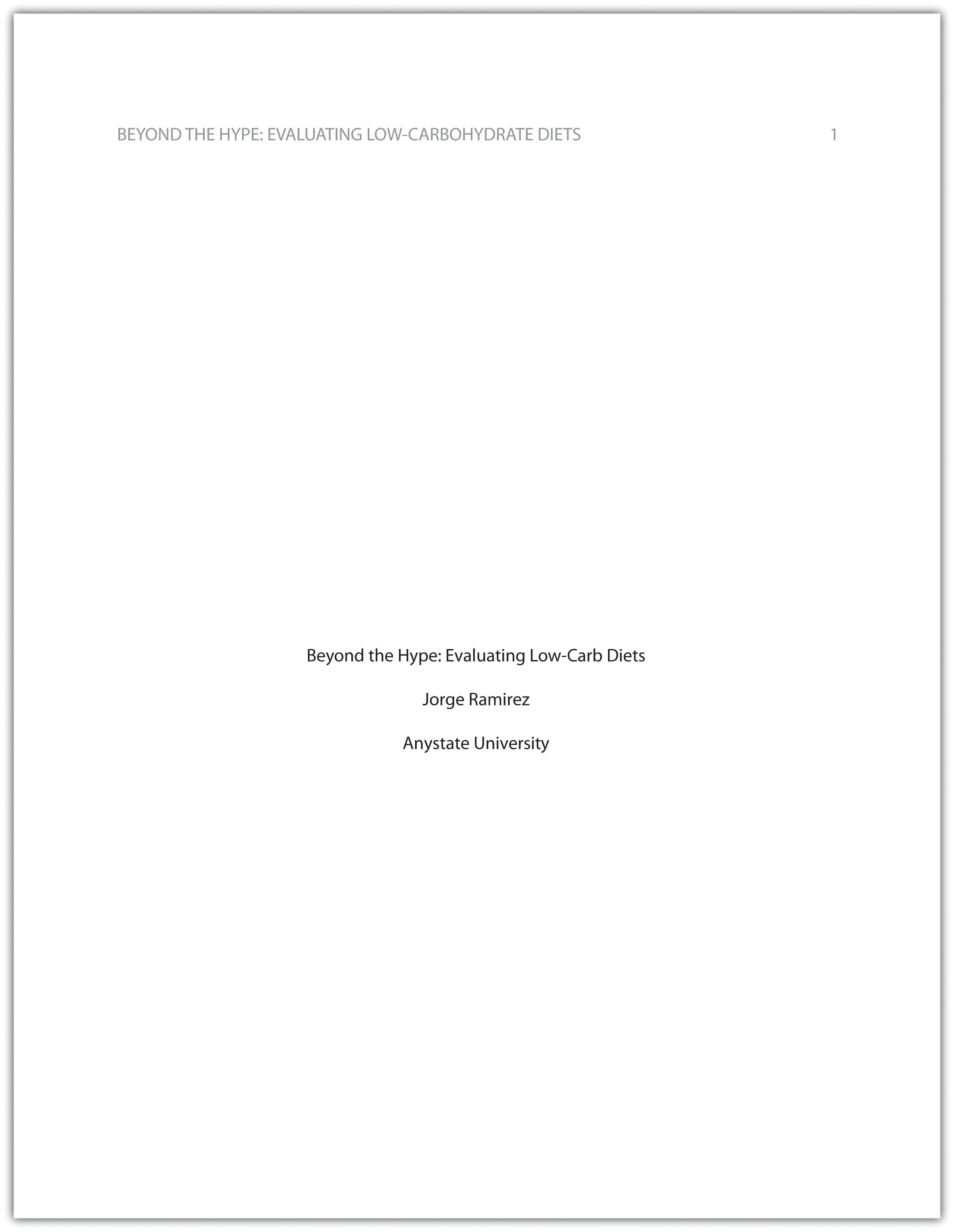
The next page of your paper provides an abstract , or brief summary of your findings. An abstract does not need to be provided in every paper, but an abstract should be used in papers that include a hypothesis. A good abstract is concise—about one hundred fifty to two hundred fifty words—and is written in an objective, impersonal style. Your writing voice will not be as apparent here as in the body of your paper. When writing the abstract, take a just-the-facts approach, and summarize your research question and your findings in a few sentences.
In Chapter 12 “Writing a Research Paper” , you read a paper written by a student named Jorge, who researched the effectiveness of low-carbohydrate diets. Read Jorge’s abstract. Note how it sums up the major ideas in his paper without going into excessive detail.
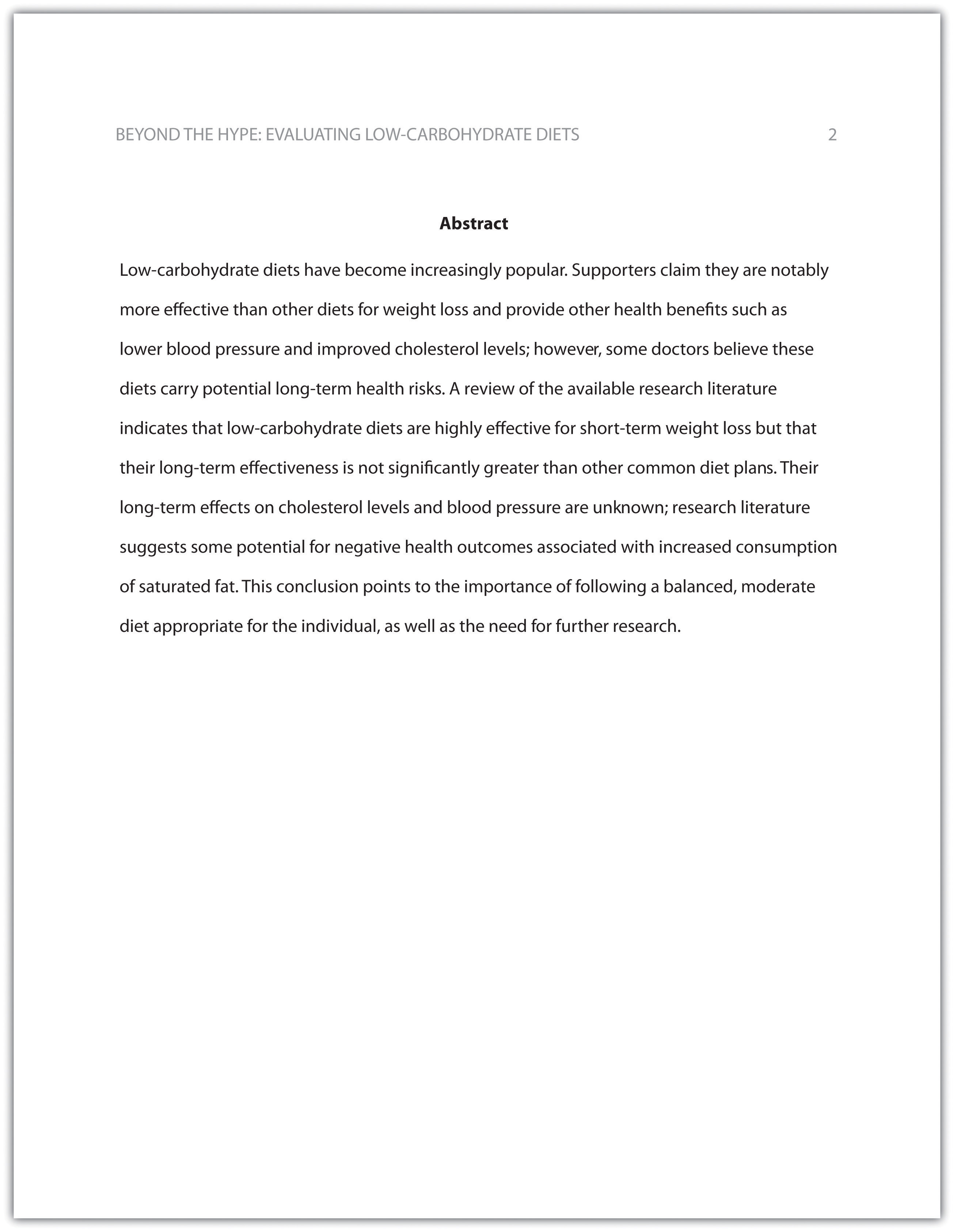
Write an abstract summarizing your paper. Briefly introduce the topic, state your findings, and sum up what conclusions you can draw from your research. Use the word count feature of your word-processing program to make sure your abstract does not exceed one hundred fifty words.
Depending on your field of study, you may sometimes write research papers that present extensive primary research, such as your own experiment or survey. In your abstract, summarize your research question and your findings, and briefly indicate how your study relates to prior research in the field.
Margins, Pagination, and Headings
APA style requirements also address specific formatting concerns, such as margins, pagination, and heading styles, within the body of the paper. Review the following APA guidelines.
Use these general guidelines to format the paper:
- Set the top, bottom, and side margins of your paper at 1 inch.
- Use double-spaced text throughout your paper.
- Use a standard font, such as Times New Roman or Arial, in a legible size (10- to 12-point).
- Use continuous pagination throughout the paper, including the title page and the references section. Page numbers appear flush right within your header.
- Section headings and subsection headings within the body of your paper use different types of formatting depending on the level of information you are presenting. Additional details from Jorge’s paper are provided.
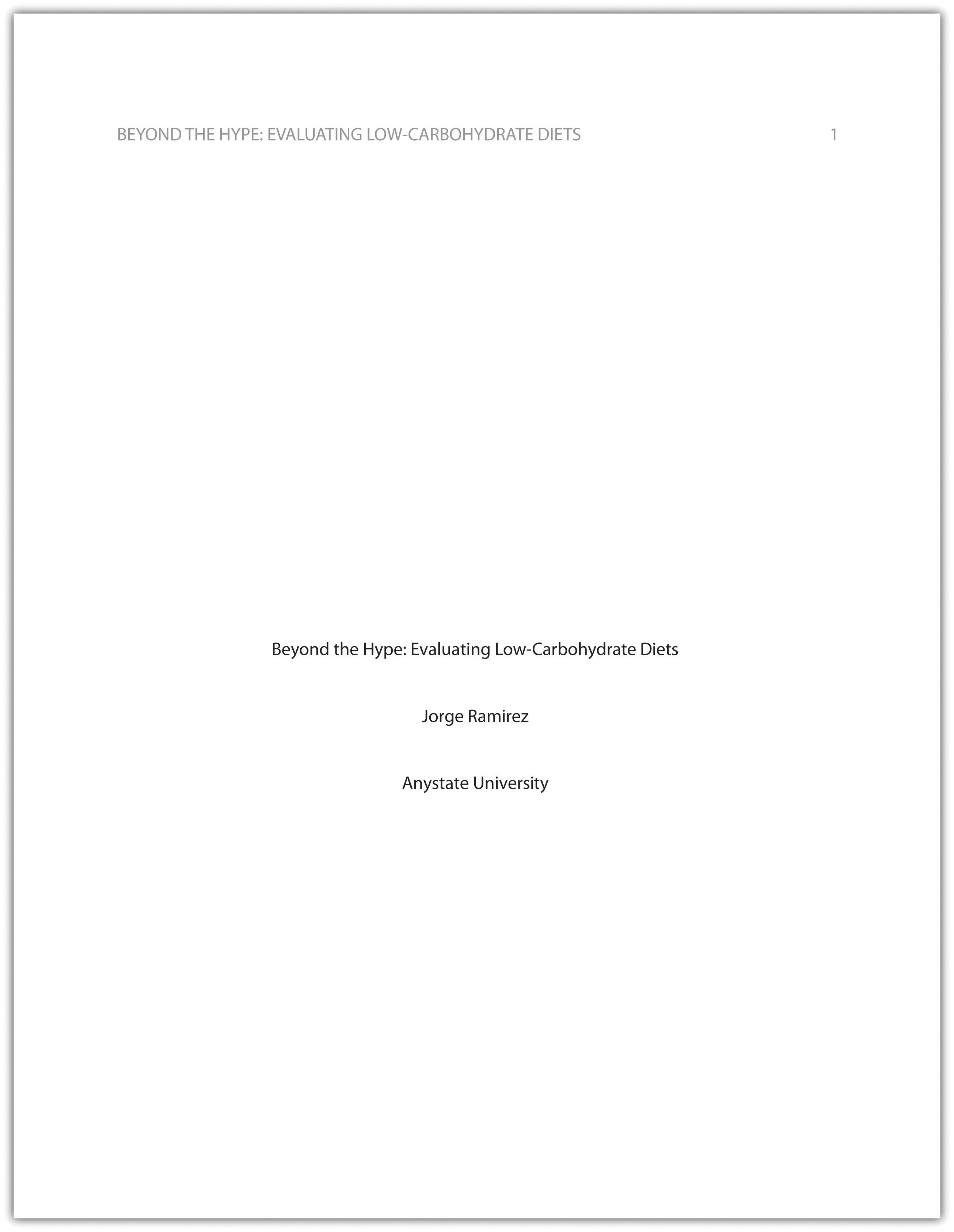
Begin formatting the final draft of your paper according to APA guidelines. You may work with an existing document or set up a new document if you choose. Include the following:
- Your title page
- The abstract you created in Note 13.8 “Exercise 1”
- Correct headers and page numbers for your title page and abstract
APA style uses section headings to organize information, making it easy for the reader to follow the writer’s train of thought and to know immediately what major topics are covered. Depending on the length and complexity of the paper, its major sections may also be divided into subsections, sub-subsections, and so on. These smaller sections, in turn, use different heading styles to indicate different levels of information. In essence, you are using headings to create a hierarchy of information.
The following heading styles used in APA formatting are listed in order of greatest to least importance:
- Section headings use centered, boldface type. Headings use title case, with important words in the heading capitalized.
- Subsection headings use left-aligned, boldface type. Headings use title case.
- The third level uses left-aligned, indented, boldface type. Headings use a capital letter only for the first word, and they end in a period.
- The fourth level follows the same style used for the previous level, but the headings are boldfaced and italicized.
- The fifth level follows the same style used for the previous level, but the headings are italicized and not boldfaced.
Visually, the hierarchy of information is organized as indicated in Table 13.1 “Section Headings” .
Table 13.1 Section Headings
A college research paper may not use all the heading levels shown in Table 13.1 “Section Headings” , but you are likely to encounter them in academic journal articles that use APA style. For a brief paper, you may find that level 1 headings suffice. Longer or more complex papers may need level 2 headings or other lower-level headings to organize information clearly. Use your outline to craft your major section headings and determine whether any subtopics are substantial enough to require additional levels of headings.
Working with the document you developed in Note 13.11 “Exercise 2” , begin setting up the heading structure of the final draft of your research paper according to APA guidelines. Include your title and at least two to three major section headings, and follow the formatting guidelines provided above. If your major sections should be broken into subsections, add those headings as well. Use your outline to help you.
Because Jorge used only level 1 headings, his Exercise 3 would look like the following:
Citation Guidelines
In-text citations.
Throughout the body of your paper, include a citation whenever you quote or paraphrase material from your research sources. As you learned in Chapter 11 “Writing from Research: What Will I Learn?” , the purpose of citations is twofold: to give credit to others for their ideas and to allow your reader to follow up and learn more about the topic if desired. Your in-text citations provide basic information about your source; each source you cite will have a longer entry in the references section that provides more detailed information.
In-text citations must provide the name of the author or authors and the year the source was published. (When a given source does not list an individual author, you may provide the source title or the name of the organization that published the material instead.) When directly quoting a source, it is also required that you include the page number where the quote appears in your citation.
This information may be included within the sentence or in a parenthetical reference at the end of the sentence, as in these examples.
Epstein (2010) points out that “junk food cannot be considered addictive in the same way that we think of psychoactive drugs as addictive” (p. 137).
Here, the writer names the source author when introducing the quote and provides the publication date in parentheses after the author’s name. The page number appears in parentheses after the closing quotation marks and before the period that ends the sentence.
Addiction researchers caution that “junk food cannot be considered addictive in the same way that we think of psychoactive drugs as addictive” (Epstein, 2010, p. 137).
Here, the writer provides a parenthetical citation at the end of the sentence that includes the author’s name, the year of publication, and the page number separated by commas. Again, the parenthetical citation is placed after the closing quotation marks and before the period at the end of the sentence.
As noted in the book Junk Food, Junk Science (Epstein, 2010, p. 137), “junk food cannot be considered addictive in the same way that we think of psychoactive drugs as addictive.”
Here, the writer chose to mention the source title in the sentence (an optional piece of information to include) and followed the title with a parenthetical citation. Note that the parenthetical citation is placed before the comma that signals the end of the introductory phrase.
David Epstein’s book Junk Food, Junk Science (2010) pointed out that “junk food cannot be considered addictive in the same way that we think of psychoactive drugs as addictive” (p. 137).
Another variation is to introduce the author and the source title in your sentence and include the publication date and page number in parentheses within the sentence or at the end of the sentence. As long as you have included the essential information, you can choose the option that works best for that particular sentence and source.
Citing a book with a single author is usually a straightforward task. Of course, your research may require that you cite many other types of sources, such as books or articles with more than one author or sources with no individual author listed. You may also need to cite sources available in both print and online and nonprint sources, such as websites and personal interviews. Chapter 13 “APA and MLA Documentation and Formatting” , Section 13.2 “Citing and Referencing Techniques” and Section 13.3 “Creating a References Section” provide extensive guidelines for citing a variety of source types.
Writing at Work
APA is just one of several different styles with its own guidelines for documentation, formatting, and language usage. Depending on your field of interest, you may be exposed to additional styles, such as the following:
- MLA style. Determined by the Modern Languages Association and used for papers in literature, languages, and other disciplines in the humanities.
- Chicago style. Outlined in the Chicago Manual of Style and sometimes used for papers in the humanities and the sciences; many professional organizations use this style for publications as well.
- Associated Press (AP) style. Used by professional journalists.
References List
The brief citations included in the body of your paper correspond to the more detailed citations provided at the end of the paper in the references section. In-text citations provide basic information—the author’s name, the publication date, and the page number if necessary—while the references section provides more extensive bibliographical information. Again, this information allows your reader to follow up on the sources you cited and do additional reading about the topic if desired.
The specific format of entries in the list of references varies slightly for different source types, but the entries generally include the following information:
- The name(s) of the author(s) or institution that wrote the source
- The year of publication and, where applicable, the exact date of publication
- The full title of the source
- For books, the city of publication
- For articles or essays, the name of the periodical or book in which the article or essay appears
- For magazine and journal articles, the volume number, issue number, and pages where the article appears
- For sources on the web, the URL where the source is located
The references page is double spaced and lists entries in alphabetical order by the author’s last name. If an entry continues for more than one line, the second line and each subsequent line are indented five spaces. Review the following example. ( Chapter 13 “APA and MLA Documentation and Formatting” , Section 13.3 “Creating a References Section” provides extensive guidelines for formatting reference entries for different types of sources.)
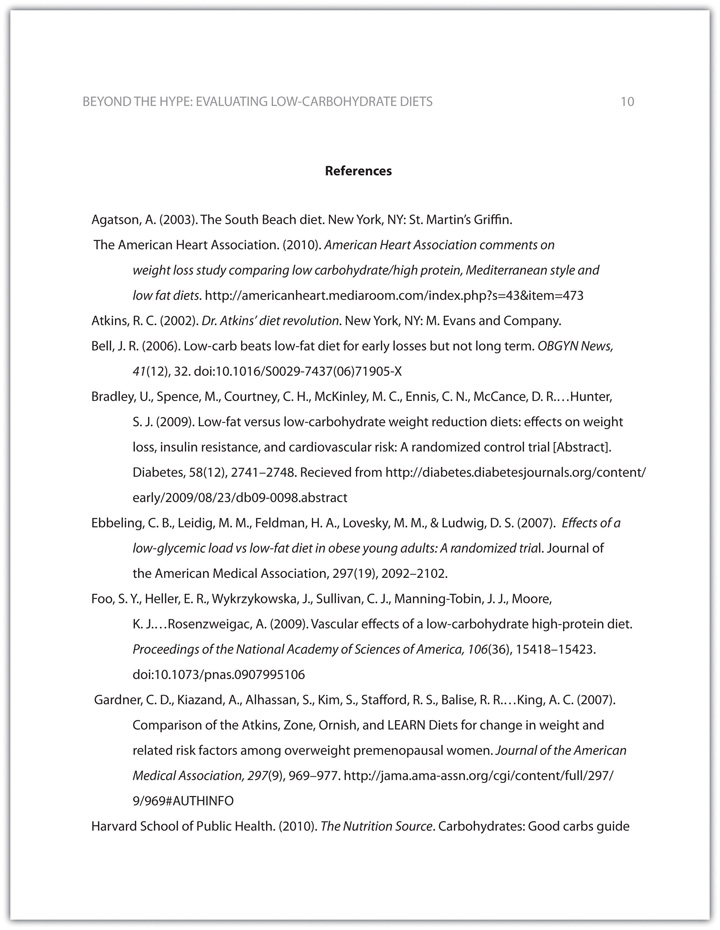
In APA style, book and article titles are formatted in sentence case, not title case. Sentence case means that only the first word is capitalized, along with any proper nouns.
Key Takeaways
- Following proper citation and formatting guidelines helps writers ensure that their work will be taken seriously, give proper credit to other authors for their work, and provide valuable information to readers.
- Working ahead and taking care to cite sources correctly the first time are ways writers can save time during the editing stage of writing a research paper.
- APA papers usually include an abstract that concisely summarizes the paper.
- APA papers use a specific headings structure to provide a clear hierarchy of information.
- In APA papers, in-text citations usually include the name(s) of the author(s) and the year of publication.
- In-text citations correspond to entries in the references section, which provide detailed bibliographical information about a source.
Writing for Success Copyright © 2015 by University of Minnesota is licensed under a Creative Commons Attribution-NonCommercial-ShareAlike 4.0 International License , except where otherwise noted.
- Color Palettes
- Baseball Team Colors
- NHL Team Colors
- Superhero Fonts
- Gaming Fonts
- Brand Fonts
- Fonts from Movies
- Similar Fonts
- What’s That Font
- Canva Resources
- Photoshop Resources
- Slide Templates
- Fast Food Logos
- Superhero logos
- Tech company logos
- Shoe Brand Logos
- Motorcycle Logos
- Grocery Store Logos
- Pharmaceutical Logos
- English Football Team Logos
- German Football Team Logos
- Spanish Football Teams Logos
- Graphic Design Basics
- Beer Brand Ads
- Car Brand Ads
- Fashion Brand Ads
- Fast Food Brand Ads
- Shoe Brand Ads
- Tech Company Ads
- Motion graphics
- Infographics
- Design Roles
- Tools and apps
- CSS & HTML
- Program interfaces
- Drawing tutorials

The Dundee United Logo History, Colors,

How to Make a Mockup in

The Celtic Logo History, Colors, Font,

How to Make an Infographic in
Design Your Way is a brand owned by SBC Design Net SRL Str. Caminului 30, Bl D3, Sc A Bucharest, Romania Registration number RO32743054 But you’ll also find us on Blvd. Ion Mihalache 15-17 at Mindspace Victoriei
Academic Appeal: The 11 Best Fonts for Academic Papers
- BY Bogdan Sandu
- 26 February 2024
Imagine settling into the rhythm of crafting your academic magnum opus—the words flow, ideas chime, yet it all hinges on how your prose meets the reader’s eye. You’re well aware that the best fonts for academic papers don’t just whisper to the intellect; they shout to the discerning critic in each evaluator. Here unfolds a narrative, not merely of typography but your academic saga’s silent ambassador.
In forging this guide, I’ve honed focus on one pivotal, often underestimated player in the academic arena: font selection .
Navigate through this roadmap and emerge with a treasure trove of legible typefaces and format tips that ensure your paper stands hallmark to clarity and professionalism.
Absorb insights—from the revered Times New Roman to the understated elegance of Arial —paired with indispensable formatting nuggets that transcend mere compliance with university guidelines .
Dive deep, and by article’s end, unlock a dossier of sage advice, setting your documents a class apart in the scrutinous world of academic scrutiny. Here’s to typography serving not just as a vessel but as your ally in the scholarly discourse.
The Best Fonts for Academic Papers
Traditional choices and their limitations, times new roman : ubiquity and readability vs. overuse.
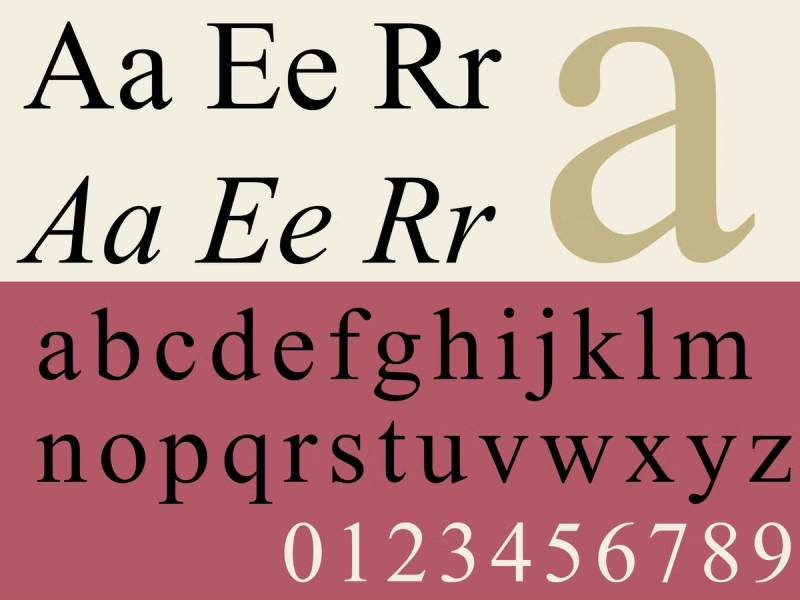
Ah, Times New Roman, the granddaddy of academic fonts. It’s like that reliable old friend, always there, always readable. But here’s the thing – it’s almost too familiar. It’s everywhere, right? Still, its readability can’t be denied, making it a solid choice for your papers.
Arial : Readability in various text blocks
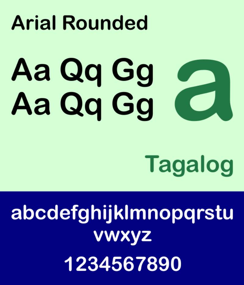
Moving on to Arial. Think of it as the breezy, modern cousin of Times New Roman. It’s straightforward, no-nonsense, and super legible in different text sizes. A safe bet for digital documents, especially if you’re aiming for that clean, contemporary look.
Calibri : Screen readability vs. printed text limitations
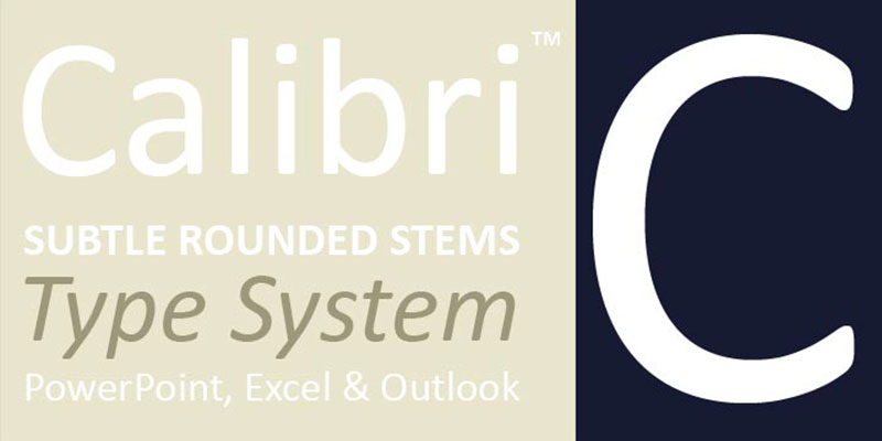
Calibri steps in as the new kid on the block. It’s a champ on screens, thanks to its clear and round characters. But beware, in print, it can lose some of that charm. It’s all about where your paper will be read.
Helvetica : Heavy use and easy readability, suitable for both print and screen
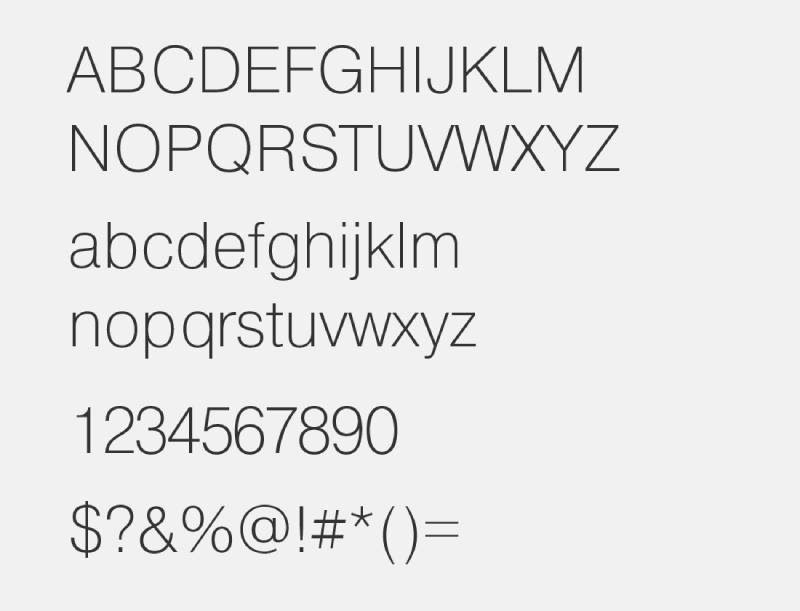
Helvetica is like the cool, versatile artist of fonts. It’s everywhere – from subway signs to tech brands. And for a good reason! It’s incredibly easy to read on any platform. A solid choice if you want your academic paper to be effortlessly readable.
Garamond : Historical significance and suitability for long prose
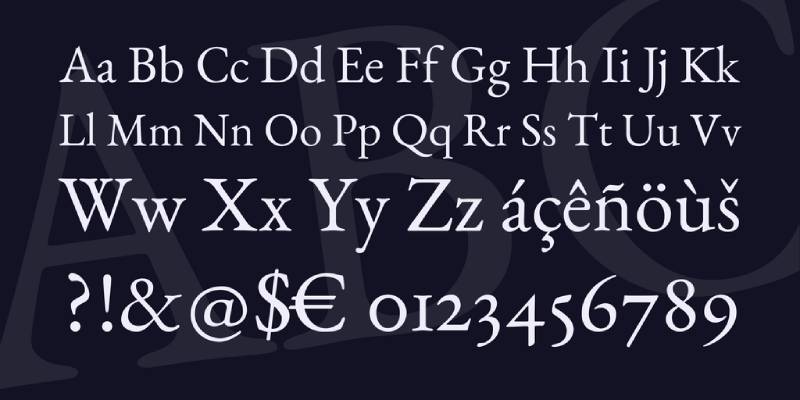
Garamond takes you back, way back. It’s got this old-school, refined vibe. Perfect for lengthy pieces thanks to its elegant and classic design. It’s like wearing a vintage jacket – stylish yet timeless.
Palatino : Elegant and readable, good for formal academic papers
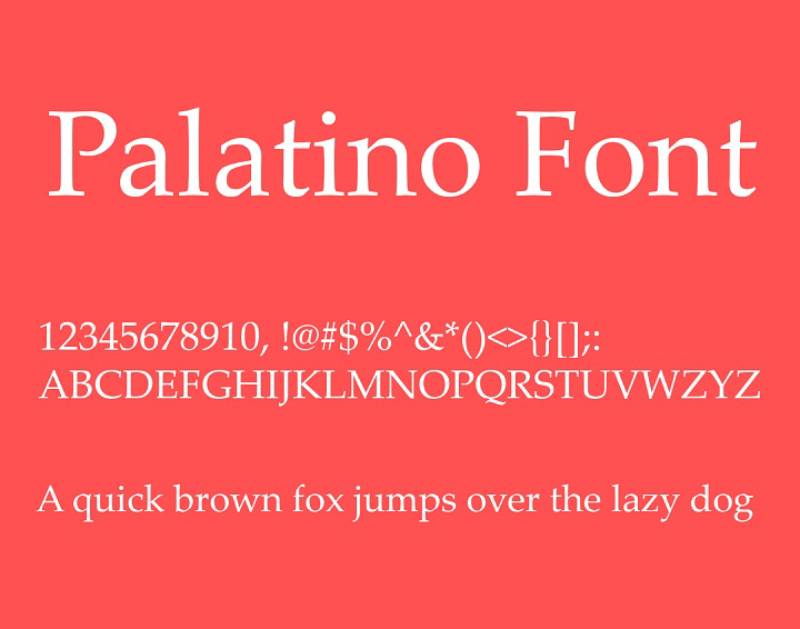
Lastly, Palatino. Picture a grand, old library – that’s Palatino. It brings a touch of elegance without sacrificing readability. Great for when you want to add a dash of formality to your work.
Serif vs. Sans Serif Fonts
Readability and formality considerations.
Now, the eternal debate: Serif or Sans Serif? Serif fonts, like Times New Roman and Garamond, bring a formal, traditional vibe. They’re often easier on the eyes for long reads. Sans Serif fonts, like Arial and Helvetica, offer a cleaner, more modern look. Perfect for shorter texts or digital platforms.
Contextual appropriateness for academic documents
Context is king. A thesis? Maybe stick to the classics like Garamond. A quick presentation? Helvetica or Arial can be your best friends. It’s all about matching the font to the purpose.
Baskerville : Positive influence on readers, ideal for print
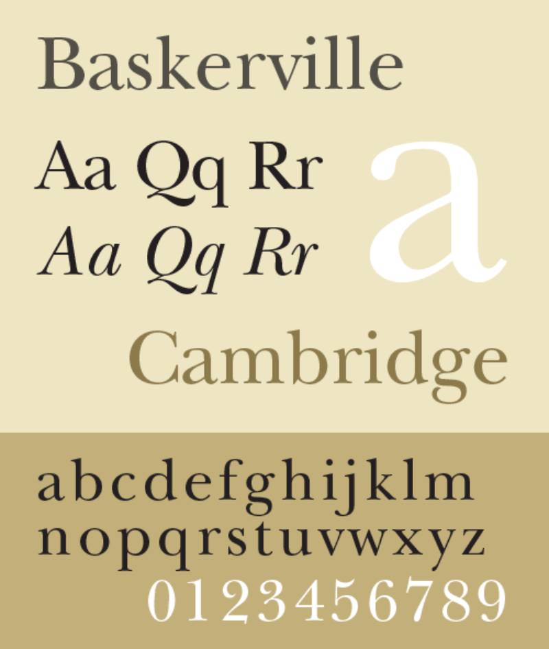
Baskerville is like a good cup of tea – comforting and reliable. It’s said to have a positive influence on readers. Ideal for print, it makes your text inviting and authoritative.
Caslon : Historical importance, suitable for blocks of text
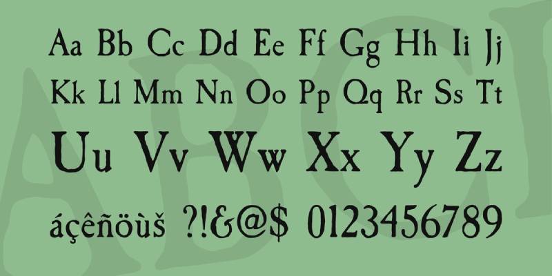
Caslon is another historical champ. It’s like stepping into an old, wise professor’s office. Perfect for large blocks of text, it brings a touch of academia’s rich history to your paper.
Georgia : Clear and legible, good for online and printed texts

Georgia strikes a balance. It’s like the hybrid car of fonts – efficient and adaptable. Equally legible online and in print, making it a versatile option for various academic documents.
Cambria : Designed for readability on screen, good for electronic submissions
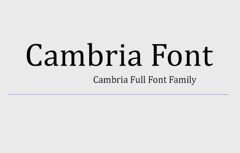
Finally, Cambria. It’s like the ergonomic chair of fonts – designed specifically for screen readability. If your paper is destined for digital eyes, Cambria’s a smart pick.
Font Size and Readability
Let’s dive into a crucial piece of the puzzle when talking about the best fonts for academic papers : Font Size and Readability. Because, let’s face it, nobody wants to squint or get lost in a sea of text.
Standard Font Sizes for Academic Papers
Recommended sizes for essays and theses.
Rule of thumb: 12 or 14 points. Why? It’s like the Goldilocks zone – not too big, not too small. Just perfect for readability without eating up too much space. Whether you’re crafting an essay or wrestling with a thesis, sticking to this size range is a safe bet.
Importance of size for readability and eye strain prevention
It’s not just about looking good; it’s about comfort too. Imagine reading pages and pages of tiny text. Hello, eye strain! Bigger isn’t always better, though. Too large, and your paper looks like a children’s book. Balance is key.
Specific Font Recommendations
Wensley modern serif for sophistication.
Meet Wensley Modern Serif. It’s like that sleek, stylish outfit you save for special occasions. Perfect for when you want your paper to dress to impress. Sophisticated yet readable, it’s a great choice for those formal papers where you need to shine.
Garamond and Palatino for long prose and formal occasions
Oldies but goodies. Garamond and Palatino are like fine wine – they never go out of style. Ideal for lengthy prose, these fonts offer a timeless look while keeping your text clear and easy on the eyes. They bring that classic academic vibe, perfect for dissertations where you want to blend tradition with readability.
Advanced Font Selection Criteria
Alright, let’s get a bit more in-depth with our journey into the best fonts for academic papers . We’re not just talking about what looks good; we’re diving into the nitty-gritty, the criteria that really make a font stand out in the academic world.
Choosing Fonts for Specific Academic Needs
Considerations for thesis writing and scientific research.
When you’re knee-deep in thesis writing or scientific research, your font choice is like picking the right tool for a delicate job. It’s not just about looking pretty; it’s about clarity, readability, and making sure your groundbreaking research isn’t overshadowed by a poor font choice. Think about fonts like Georgia or Cambria ; they’re like the reliable workhorses of academic fonts.
Balancing legibility and aesthetic appeal
Now, don’t get me wrong, aesthetics matter too. You want your paper to not only be easy to read but also pleasing to the eye. It’s like dressing up your words in their Sunday best. A font like Palatino might just strike that perfect balance between looking sharp and being crystal clear.
Combining Different Typefaces
Strategies for using serif body text with sans serif headings.
Mixing it up can be fun! Using a serif font for your body text and a sans serif for headings is like having a well-coordinated outfit with a snazzy hat. It grabs attention where you want it and keeps the reader flowing through your paper. Imagine Garamond for your main text and Arial for your headings – classic, yet modern.
Recommended combinations for visual hierarchy and readability
This is where you play director and guide your reader’s eyes through your masterpiece. Pair a strong, bold sans serif like Helvetica for titles with a subtle, easy-on-the-eyes serif like Times New Roman for your main text. It’s like setting up signposts, making sure your reader doesn’t get lost in the sea of words.
Contemporary and Popular Font Choices
Alright, let’s jump into the present and look at what’s hot right now in the world of best fonts for academic papers . We’re talking fresh, modern, and yes, even trendy. But still, all about that readability and academic vibe.
Modern Fonts for Academic Writing
Constantia for screen and print readability.
First up, Constantia. It’s like the chameleon of fonts, equally at home on screen and paper. It’s got this subtle elegance that makes your academic work look effortlessly chic yet totally approachable. Plus, your eyes will thank you after those long hours of reading and writing.

Helvetica and Baskerville for professional and positive influence
Now, Helvetica is the kind of font that walks into a room and everyone notices – in a good way. It’s clean, it’s professional, and let’s be honest, it just looks cool. Pair it with Baskerville, and you’ve got a combo that’s not only pleasing to the eye but also brings a positive vibe to your work.
The Rise of Digital-Optimized Fonts
Calibri’s popularity and suitability for digital platforms.
Calibri is like the friendly neighbor of fonts – familiar, reliable, and perfect for digital papers. It’s become super popular for a reason. It’s like it was made for the screen, which, let’s face it, is where most of our work ends up these days.
Times New Roman’s historical significance and widespread use
And then there’s Times New Roman. The OG of academic fonts. It’s got history, it’s got style, and yes, it’s everywhere, but that’s because it works. It’s like the classic blue jeans of fonts – you just can’t go wrong with it.
FAQ On The Best Fonts For Academic Papers
What’s the best font for readability in academic papers.
Serif fonts rule the academic roost for legibility. Times New Roman stands out; it’s visually comfortable for long reads—your thesis panel will thank you. Serifs guide the reader’s eye along lines of text, a scholarly norm.
Can I use sans-serif fonts for my dissertation?
Most committees nod approval at sans-serif fonts for figures and tables. Think Arial or Calibri —crisp for data presentation. Main text? Stick to serifs. Sans-serifs are modern, sure, but tradition wins in dissertation style.
Is there an ideal font size for academic documents?
Size 12 strikes a balance—neither squint-inducing nor space-hogging. It’s the go-to for MLA and APA guidelines . Exceptions exist; footnotes and figure text often shrink to size 10 without side-eye from the scholarly crowd.
Does line spacing matter in academic papers?
Absolutely. Double-spacing is your friend here. It allows breathing room for annotations and comments—a courtesy to readers and graders. Plus, formatting guidelines generally mandate it for everything except block quotations, footnotes, and bibliographic entries.
Should I use different fonts for headings and subheadings?
Consistency is key but differentiate hierarchically. Use bold or italics for distinction, maintaining the same font family. This unifies the document while subtly navigating readers through your paper’s structure.
What’s the most accepted font for academic journal submissions?
Journals often have publisher requirements — Times New Roman, 12-point font frequently tops the list. When in doubt, consult the submission guidelines to avoid the faux pas of using a non-standard font.
What are some lesser-known fonts suitable for academic writing?
Branch out with Garamond —it’s elegant and legible. Book Antiqua also offers that classic vibe without being overused. Exploring beyond Microsoft Word’s default list can distinguish your work subtly yet effectively.
How crucial is font choice in peer-reviewed papers?
Font choice is your paper’s handshakes—first impressions matter. Legible typefaces support peer reviewers in engaging thoroughly with content. Underestimating font’s impact is akin to ignoring the dress code at a gala—noticeable and potentially distracting.
Do different academic fields prefer specific fonts?
Indeed, fields pivot on tradition. Humanities often herald Times New Roman ; STEM fields lean into Arial’s clean lines for clarity in data-driven documents. Match your font to the field’s ethos.
Can I be creative with fonts in my academic paper?
Creativity in academics lives in content, less in formatting. Keep the font choice within the bounds of readability and academic institution guidelines . Let your research shout, not your typeface. Originality lands in your discoveries, not font escapades.
Stepping back, eyeing the canvas of our discourse on the best fonts for academic papers , it’s clear: Typography wields quiet power—shaping perception, ensuring clarity, the unsung hero in the story of academic success. Serif fonts —with Times New Roman at the helm—have held the baton in traditional scholarly compositions, swaying with the rhythm of legibility and convention .
Yet, amidst the staccato of intellectual exchange, the modern beats of Arial and Calibri press forth—bringing sleekness to tables and lucidity to data. Foreground this takeaway: your words, the intense research, the hypotheses—they’re the protagonists. Fonts , however, set the stage, inviting eyes to linger longer, to comprehend without strain.
So, equip your arsenal with the typographic titans treasured in these halls of learning. Their silent echo underscores your voice, bearing it aloft through the critical gaze of peers and mentors. With this map in hand, chart a course through the vast sea of academia—poised to make your indelible mark.
If you liked this article about the best fonts for academic papers , you should check out this article about the best fonts for accessibility .
There are also similar articles discussing the best fonts for children’s books , the best fonts for neon signs , the best fonts for vinyl lettering , and the best fonts for invitations .
And let’s not forget about articles on the best fonts for Google Slides , the best fonts for mobile apps , the best fonts for blogs , and the best fonts for magazines .
Also, you can check here the version of this article about fonts for academic papers in German .
- Recent Posts
- The Dundee United Logo History, Colors, Font, And Meaning - 8 November 2024
- How to Make a Mockup in Canva: Beginner’s Guide - 8 November 2024
- The Celtic Logo History, Colors, Font, And Meaning - 7 November 2024

The Pittsburgh Penguins Logo History, Colors, Font, And Meaning
The dallas stars logo history, colors, font, and meaning.

You may also like

Ad Impact: The 19 Best Fonts for Advertising
- Bogdan Sandu
- 20 December 2023

T-Shirt Typography: 30 Best Fonts for T-Shirts
- 21 December 2023

5 fonts that add credibility and professionalism to scientific research
by ikumikayama | Apr 29, 2013 | Uncategorized | 14 comments

Choosing the right fonts can affect how your scientific research is received.
Note: This is part 2 of a 2-part blog series about choices in fonts. You can read part 1 here .
You are dressed in your best. You edited the manuscript with a fine-tooth comb…but are your figures and images wearing flip-flops?
Last time we talked about fonts that suck professionalism out of your scientific research . In this article, we’ll talk about fonts that actually add credibility and professionalism to your research. Dress your research in a custom-tailored suit by just using these fonts!
My friend and colleague, Cassio Lynm described how a good figure should be like a billboard found in many highways around the country. Anyone who sees the billboard will understand what they are advertising in a split second. If someone is confused or gets the wrong idea, the image is not very successful.
Similarly, the best professional fonts should be one that’s easy to read with very little “bells and whistles”. When writing prose of informational value such as scientific research, a reader should pay attention to what the text is describing, not how the text looks. A good professional font should be like air–we don’t really even pay attention to it most of the time.
Some of the fonts I’ll share with you today are considered “boring” and “overused” by some. These fonts are everywhere because they are champions of legibility and simplicity. Make your work professional and trustworthy by using a time-tested font.
[bra_divider height=’40’]
1. Arial- “All-Around Champion with IBM Roots”

According to fonts.com , Arial is one of the most used typefaces of the last 30 years. Its electronic origins go back to 1982 for IBM laser-xerographic printers by designers Robin Nicholas and Patricia Saunders. When it came out, it was supposed to compete with Helvetica, which was one of the core fonts in Apple Computers in the mid 1980’s.
Arial letters have more round shapes and the edges of letters do not end in a horizontal line. Instead, the edges are at an angle.
Arial is an easy-to-read font in small and large blocks of text. Nature requests that the figure text be in Arial or Helvetica. It’s especially nice for figure labels and legends. When using Arial as figure legends, keep the font size small ~8 points for best results.
2. Helvetica- “All-Around Champion with Apple Roots”

Helvetica is the most heavily-used font. Helvetica was originally designed by a Swiss designer named Max Miedinger in 1957. The font was designed to be an easy-to-read font. The name “Helvetica” comes from “Helvetia” – Latin name for Switzerland. Actually, the font received a facelift in 1983-the newer version is called, you guessed it, Neue Helvetica.
Helvetica even has its own movie . I haven’t seen it yet, but please comment in the section below if you have.
Besides its Hollywood (Indie) status, Helvetica is a font that looks great on both print and on screen. Nature , Science , and Cell request that their figure labels be in Helvetica. (If you need assistance setting up figures, I’m here to help). It looks great small as in figure labels, and it looks pretty good in large formats as posters. I lost count of how many figures I labeled using Helvetica, since that’s what one of the publishers used for their books.
3. Baskerville- “Tends to have positive influence on readers”

Baskerville’s history goes all the way back to 1757 when John Baskerville designed a typeface that works well in print and easy to read. Mr. Baskerville preferred his letters simple and refined. He was also a writing master, so he had some ornamental letters like the upper case Q.
There was an informal study (not official, but some experiments here and there) that showed using Baskerville font increased trustworthiness of the text compared to other fonts. In the same study, Comic Sans had the most negative influence on the readers.
Baskerville is a serif font, which means that there are “tails” at the edge of the letters. Generally, serif fonts are better suited for print. This font works best when used in long blocks of text. Try to keep this font between 8 and 14pts for best results. This font looks dignified, so use this for your important professional occasions-award ceremonies, recognitions, etc.
4. Caslon- “When in doubt, use Caslon”

Caslon is another font with a long history. William Cason I designed the typeface back in the early 1700’s. This font is considered as the first original typeface from England. This font was very popular in colonial America, and it was used for many historical documents including the US Declaration of Independence.
Caslon is a serif font (with tails), and is best used in blocks of text. Like Baskerville, try to keep this font between 8 and 14 points for best results. Using this in a report or an application would be a good places.
5. Garamond – “Second best font after Helvetica”

This font’s history also goes way back. The font was designed by Claude Garamond (or Jean Jannon), who was commissioned to make a typeface for King Francis I of France (1515-47) to be used in series of books. The modern, electric version was revived in 1989 by Robert Slimbach.
Because there are different sources available for Garamond, there are numbers of different variations of the font. Adobe Garamond is the most popular and widely-available version today.
Garamond is still used extensively by French publishers. They also insist that Garamond be printed in size 9. Some of the most famous publications in France are in Garamond such as Histoire de l’édition français. The publishers prefer this font “for its beauty, its richness and its legibility” combined with “an uncluttered graphic style that underscores the rigour of essays and analysis providing a radical critique of contemporary society”.
Garamond is a great font to be used in long proses such as textbooks, dissertations and theses. Keeping it at 9 point is optional. In fact, my master’s thesis was in Garamond.
So that’s the 5 fonts that add credibility and professionalism to your scientific research. Did you find your favorite fonts here? Do you have other favorites? Please share your thoughts in the comment section. Also, please feel free to send this article along to those who might benefit from this short article.
[bra_border_divider top=’10’ bottom=’10’]
Now that you know about great scientific fonts, learn more about: PowerPoint Tips for the Scientist

Sources and Further reading:
Arial vs Helvetica – fonts.com
Research on font trustworthiness: Baskerville vs. Comic Sans
Caslon typeface
History of Garamond
Cell Press Figure Guide
Nature -Guide to preparing final artwork
Science Magazine: Preparing your manuscript
14 Comments
I’d rather like to know which font was used to write that article – it’s simple and readable, better than all presented above.
And the font being used for that article is Helvetica, which is one of the fonts mentioned above 😀
Hi Ewa! Great point. The font used is called “Open Sans” by Steve Matteson. For my blog, I made the font color dark grey to make it easier on the eyes, and also made them slightly bigger than average for easier reading. Hope this helps!
Hollo there, i liked the article but none of this fonts looks like the one used in the papers i read, (Journals of the American Chemical Society), do you know which one they use?
Hi There! Thank you for the note! ACS suggests Arial and Helvetica for their journal figures, so that’s what I introduced in this article–for the text, they might very well have their own custom font they use for their publications. I’ll dig into this a little deeper–thank you again!
I’m sorry, but this article is full of misinformation. Part 1 is a reiteration of articles that have been around for years. Absolutely nothing new there, and honestly, is there anyone even considering the typefaces you name there for scientific articles? Is it conceivable that anyone would use Curlz for his essay?
But my real concern goes to the second part. Arial and Helvetica are absolutely not scientific typefaces. The notion that ACS suggests these typefaces doesn’t make them suitable for scientific works. I think you ought to do research as to WHY these typefaces came recommended. Helvetica has history, as it won out of contemporaries like Univers as Helvetica was very heavily marketed. As a side note, Helvetica is actually based on the Akzidenz Grotesk model. Arial was designed to have the same metrics as Helvetica so it could be used on the same printers without having to pay a license fee to use Helvetica. Arial is more legible while Helvetica is more neutral and clear, but neither is particularly great.
So I would say Helvetica and Arial haven’t been chosen because they’re perfect. They’ve been chosen because they’re popular, and Arial is on every Windows computer, so people don’t have to purchase any fonts. I would say neither Arial and Helvetica are known to be particularly good to read. I suspect typefaces like Proxima Nova and Avenir will fair better. To be clear, I don’t think Arial or Helvetica are bad choices for labels and such, but to suggest them as top 5 typefaces, that’s very clearly misinformation.
“When using Arial as figure legends, keep the font size small ~8 points for best results.” For best results? Not entirely. It’s probably a good estimate, but in actuality the pt size should depend on the layout. I would recommend always making a test print to see if the text looks good in print, if that’s what it is intended for. Sometimes 0.2pts more or less could make the difference.
“Helvetica is the most heavily-used font.” I don’t think so. First off, Helvetica is not a font. It’s a typeface. Helvetica Regular would be a font. Helvetica is the most heavily-used typeface in graphic design, and likely the most heavily-used sans typeface. It’s not the most heavily-used typeface. At least, I would be very surprised if it was. I suspect Times New Roman is the most heavily-used.
“The font was designed to be an easy-to-read font.” No, Helvetica was designed to steal the popularity of Akzidenz Grotesk away.
Also, follow this link to see some of the problems of Helvetica at small sizes, and what professionals in the field have to say about it: http://spiekermann.com/en/helvetica-sucks/
“Actually, the font received a facelift in 1983-the newer version is called, you guessed it, Neue Helvetica.” Who would guess that the prefix for the new Helvetica would be German though? Small detail… Anyway, if you like Helvetica but want a more professional typeface (because really, Max Miedinger was not a type designer and as far as I’m concerned that shows), I can recommend Neue Haas Grotesk (a typeface that is true to the original Helvetica, but improved) or Neue Haas Unica (a more fresh looking Helvetica that deviates from the original).
“Helvetica even has its own movie. I haven’t seen it yet, but please comment in the section below if you have.” I have seen it a few times now. It’s quite a pleasure to watch, but there’s a lot of propaganda involved as well. You have the likes of Massimo Vignelli drooling over how great Helvetica is. The man was a pretty great graphic designer (although insisting on always using Helvetica has little to do with graphic design, as one ought to select the perfect typeface for the job, not use one typeface for every job), but he had no insight in type design. On the other hand, you have Erik Spiekermann formulate perfectly what Helvetica stands for. I would say for a type designer the Helvetica documentary is quite pleasant to watch. For the layman I’m afraid the documentary amounts to propaganda. It gives the layman the feeling this is one of the best typefaces out there and it’s simply not, by far.
“Besides its Hollywood (Indie) status, Helvetica is a font that looks great on both print and on screen.” Absolutely not! On Windows computers, websites set in Helvetica tend to look horrendous. The problem is that Helvetica is not well hinted, and so rendering problems occur. Helvetica was obviously not designed for monitors. Neue Helvetica doesn’t have the rendering problem to the same extent I believe, but relatively few people have Neue Helvetica, so it wouldn’t be wise to use that on your website, unless you embed the fonts. For websites I highly recommend using Arial rather than Helvetica.
“Baskerville’s history goes all the way back to 1757 when John Baskerville designed a typeface that works well in print and easy to read.” Easy to read? Not particularly, though it’s not bad either. Baskerville is a transitional typeface, meaning the weight modulation is vertical and the contrast is high. This is the tradition of the Baroque, but it’s not the most pleasant to read. However, Baskerville does look quite academic. For typefaces that are more pleasant to read, I would look at the Garalde style. Garamond and Caslon belong to that classification. They have a diagonal weight modulation, which naturally leads the eyes to the next letters. Typefaces with vertical weight modulation and high contrast tend to feature a fence effect, which disturbs the reading experience. To see this effect well, look at Didone typefaces like Didot and Bodoni.
“This font works best when used in long blocks of text. Try to keep this font between 8 and 14pts for best results.” 14pt seems quite large. Try 9–12pt. This goes for any serif typeface to be used for body text that is intended for print (for the web try 10–14pt, also depending on which device it’s intended for). But again, it will depend on the layout, and always make test prints to make sure it’s pleasant to read.
“Garamond is a great font to be used in long proses such as textbooks, dissertations and theses. Keeping it at 9 point is optional. In fact, my master’s thesis was in Garamond.” I distinctly remember years ago I noticed my Harry Potter book was set in Garamond. Both Garamond and Caslon are still used extensively for books.
However, Garamond may be a bit much for scientific documents. It’s quite classical and it has a low x-height, which these days is not preferable. Caslon is a bit less expressive and has a taller x-height. I would say Caslon is probably better for scientific articles.
One group of typefaces that certainly seems to be missing here is Century. Typefaces like Century Roman and Century Schoolbook. They belong to the Clarendon classification and are reminiscent of typefaces like Baskerville. These typefaces have been popular since the late 19th century and are still used extensively in academic literature. But I suppose you should also make a consideration of whether your article should be about the most comfortable typefaces to read, or the best suitable for scientific work, because they most certainly don’t amount to the same thing, yet you seem to be equating the two in this article.
Hi Martin! Thank you so much for your in-depth note! I have to look over and digest all your excellent points. Would you be open to expanding your writing and be a guest author or send me a link to your website/blog so the readers can have more information about what types to use for their work?
THE quick brown fox jumps over the lazy dog!!!!!
Leelawadee is a bit underrated. It is easy on the eyes, and simple. It could use a bit of a TimesNewRoman-punch to it, though.
Where can I download Helvetica from? I couldn’t find it anywhere
Seriously? I don’t know what this smug guy does with typography, in which he seems to be well versed, but if he were to take up writing he would need to work on his grammar.
I’m not an expert on fonts, but I’m currently using Helvetica for headlines and other Sans text in my thesis and DejaVu for the main text. Feels pretty scientific to me 🙂
I enjoyed the historical aspect of this article. Thanks! PS. I see you use a sans serif font.
How i download these font types?

How to Format Your Research Paper
Writing your paper: apa 7th edition, apa style papers 7th edition.
- MLA Paper Format
- Chicago Paper Format
- Hanging Indents
- Ask a Librarian
APA 7th Edition Resources
- APA Style | Style and Grammar Guidelines The style and grammar guidelines pages present information about APA Style as described in the Publication Manual of the American Psychological Association, Seventh Edition.
- Purdue OWL: APA Style Guide This Purdue OWL style guide will help you in citing your sources in the APA Style commonly used to cite sources within the area of social sciences.
Things to know before you begin:
- Sans serif fonts: Arial (11-point), Calibri (11-point), or Lucinda Sans Unicode (10-point)
- Serif fonts: Times New Roman (12-point), Georgia (11-point), or Computer Modern (10-point)
- Margins: 1 inch on all sides
- Paragraphs: All paragraphs (except in the Abstract) should be indented
- Spacing: All of the text in your paper should be double-spaced (title page included)
Typical APA style papers have four main sections:
See the tabs below for a breakdown of how each portion should be formatted.
- Paper Templates
- Sample Papers
- APA 7 Citations
Below you will find templates for APA Style papers. Click the link to make a copy of the file.
- Google Docs : To make a copy of these templates you must first sign in to your Google account. After you’re signed in, click "File" and then click “Make a Copy.”
- Microsoft Word : To make a copy of these templates download the file.
- APA Style Student Paper Template (7th Edition) - Word Download a copy of this Word Doc and change the pre-filled information to your own.
APA Style Report Templates: These templates include multiple heading levels and should be used for report style papers.
- APA Style Student Report Template (7th Edition) - Word Download a copy of this Word Doc and change the pre-filled information to your own.
Below you will find an example of an accurately formatted APA Style student paper.
- APA Style Student Paper Sample (7th Edition) - PDF Click here to see a sample of an accurately formatted APA style student paper.
- APA Style Student Paper Sample (7th Edition) - Word Click here to see a sample of an accurately formatted APA style student paper.

Place only page numbers in the header.
Your paper should have the full title in bold. Place an extra space beneath the title and before your name.
Your name, your affiliation, the course title, professor’s name, and due date should be double spaced beneath the title.
All of this should be in the center of the title page.

- Put the word “Abstract” on the top of the page. Be sure it is center-aligned and in bold.
- Do not indent any paragraphs on this page.
Indent all other paragraphs throughout the body of the paper.

- Place the entire title of your paper in Title Case on the top line of a new page.
- Be sure it is center-aligned and in bold.

- Center-align the word “References” on the first line of a new page, be sure that it is in bold.
- Your citations should be alphabetized.
- Entries are double-spaced with no extra lines between them.
- Be sure to use a hanging indent for any citations that require more than one line.
Need help formatting your APA style citations using the 7th edition of the Publication Manual of the American Psychological Association ? Click the image or link below to go to the citation guide.

- APA 7th Edition Citations
Need help learning what hanging indents are and how to create them using Google Docs or Microsoft Word?

- Hanging Indents This page gives a brief description of what they are, where to find information on when and how to properly use them, and also video tutorials on how to create them.
- << Previous: Home
- Next: MLA Paper Format >>
- Last Updated: Jul 19, 2024 3:41 PM
- URL: https://necc.mass.libguides.com/formatting
To cite this LibGuide use the following templates:
APA : Northern Essex Community College Library. (Date updated). Title of page . Title of LibGuide. URL
MLA : Northern Essex Community College Library. "Title of Page." Title of LibGuide, Date updated, URL.

APA 7th ed. Style Guide
- Formatting Your Paper
- In-text Citations
- Textual Works
- Data Sets, Software, Tests
- Audiovisual Media
- Online Media
Formatting guidelines and sample papers are found in chapter 2 of the APA 7th edition Publication Manual
Sample papers.
You can find sample papers from Purdue OWL's website, APA 7th edition Publication Manual, or APA style website.
- APA Style Student Paper with Annotations in the Comments A Word Document featuring an APA 7th edition Style Student Paper that includes annotations as comments.
- APA Style Professional Paper with Annotations in Comments A Word Document featuring an APA 7th edition Style Professional Paper that includes annotations as comments.
- Purdue OWL Sample Papers
General Formatting Guidelines
Follow these guidelines throughout your paper:
- Double space text
- Header for student and professional papers includes the page number in the upper right hand corner
- Single space after ending punctuation
- Font size and style: Times New Roman 12 pt, Arial 11 pt, Calibri 11 pt, or Georgia 11 pt
- Use the same font type and size throughout the paper (exceptions for figure images, computer code, and footnotes - see 2.19 in APA Manual)
- Margins: 1 inch on all sides
- Left align paragraphs and leave ragged (uneven) margins on the right
- Indention: use 0.5 inch indention for the first line of every paragraph (use tab key for consistency)
Formatting Title Page
The 7th edition Publication Manual for APA introduced the student and professional papers. The major difference between these two types of papers is found on the title page. Please, see the guidelines below for formatting the title page of your document. Also note, follow your professors' guidelines for formatting the title page.
General Title Page Guidelines:
- Double space
- The title should summarize the main idea and be focused/succinct (avoid unnecessary words)
- Title written in title case (the first letter of each word is capitalized), bold, centered, and positioned in the upper half of the title page
- Use the author(s) first name, middle initial, and last name as the author's byline
Student Papers:
- title of the paper
- name of the author(s)
- author affiliation (department and institution name)
- course number and name
- instructor name
- assignment due date (i.e. November 4, 2020)
- page number (in the header)
Professional Papers:
- author affiliation
- author note
- running head (abbreviated title) - Flush with left margin and written in all capital letters
Formatting Headings

Follow this format for headings (see 2.27 of the Publication Manual for additional details):
Level 1 headings are written in bold title case and aligned to the center. The text begins as a new paragraph.
Level 2 headings are written in bold title case and aligned flush to the left. The text begins as a new paragraph.
Level 3 headings are written in bold, italicized title case, and aligned flush to the left. The text begins as a new paragraph.
Level 4 headings are written in bold title case, indented from the left, and end with a period. The text begins after the period and continues like a regular paragraph.
Level 5 headings are written in bold, italicized title case, indented from the left, and end with a period. The text begins after the period and continues like a regular paragraph.
Formatting Reference List
The following are guidelines for formatting your reference list:
- Start on a new page after the last page of text
- Label the page Reference(s) with a capitalized R, written in bold and centered
- Double space all entries
- Use hanging indent for reference entries (first line of the reference is flush with left margin, subsequent lines are indented 0.5 inches)
- Order alphabetically (see chapter 9 section 44-49 for additional instructions on entry order)
- << Previous: Home
- Next: In-text Citations >>
- Last Updated: Mar 20, 2024 11:48 AM
- URL: https://guides.uu.edu/APA7

IMAGES
VIDEO
COMMENTS
Set the top, bottom, and side margins of your paper at 1 inch. Use double-spaced text throughout your paper. Use a standard font, such as Times New Roman or Arial, in a legible size (10- to 12-point). Use continuous pagination throughout the paper, including the title page and the references section.
Font. A variety of fonts are permitted in APA Style papers. Font options include the following: sans serif fonts such as 11-point Calibri, 11-point Arial, or 10-point Lucida Sans Unicode.
Explore the best fonts for academic papers: tips on readability, style, and the perfect typography choices for essays, theses, and research.
The formatting of a research paper is different depending on which style guide you’re following. In addition to citations, APA, MLA, and Chicago provide format guidelines for things like font choices, page layout, format of headings and the format of the reference page.
Dress your research in a custom-tailored suit by just using these fonts! My friend and colleague, Cassio Lynm described how a good figure should be like a billboard found in many highways around the country.
This table describes how to format your research paper using either the MLA or APA guidelines. Be sure to follow any additional instructions that your teacher provides. MLA Guidelines. APA Guidelines. Paper. Standard size (8.5 x 11" in the U.S.) Page Margins.
If your instructor has specific requirements for the format of your research paper, check them before preparing your final draft. When you submit your paper, be sure to keep a secure copy. The most common formatting is presented in the sections below: Margins. Text Formatting.
Font & Font Size: Be sure to use the same font throughout your entire paper. APA 7th Edition allows for the use of the fonts listed below. Sans serif fonts: Arial (11-point), Calibri (11-point), or Lucinda Sans Unicode (10-point) Serif fonts: Times New Roman (12-point), Georgia (11-point), or Computer Modern (10-point) Margins: 1 inch on all sides
Use a legible font. The default font of your word-processing program is acceptable. Many sans serif and serif fonts can be used in APA Style, including 11-point Calibri, 11-point Arial, 12-point Times New Roman, and 11-point Georgia. You can also use other fonts described on the font page of the website. Line spacing.
Follow these guidelines throughout your paper: Double space text; Header for student and professional papers includes the page number in the upper right hand corner; Single space after ending punctuation; Font size and style: Times New Roman 12 pt, Arial 11 pt, Calibri 11 pt, or Georgia 11 pt