What’s the Best Resume Font, Size, and Format [For 2024]

When you’re working on your resume the font might be the last thing on your mind.
But details matter.
And something that might seem insignificant at first, like your resume font, can have a huge impact on whether you get the job or not.
Why’s that?
Consider the resume readability.
You may have the best resume in the world, but if the font is assaulting the HR manager’s eyes, well , chances are, they’re not going to give you a call back any time soon.
Similarly, if you go with the most boring font that’s almost camouflaging with the background, they just might forget about your resume by the end of the day.
Most HR managers don’t spend a whole lot of time on actually analyzing your resume. The very first they look at is the resume layout and only then do they go through the contents.
If the layout is good (e.g. 1 page, looks good, easy-to-scan, etc.) and the font looks readable - only then will they decide if it’s worth a read or not.
And remember, this is only done in a matter of seconds.
So, imagine someone glances at your resume. What first impression is your font giving off?
Do you want your resume to stand out and go in the right box?
If so, read on to find out:
- What's the Best Resume Font & Size

How to Format Your Resume
How to make your resume (the easy way), what’s the best resume font & size.
When it comes to font and font size, we generally recommend going with something that stands out, but not too much.
The font you go with has a direct impact on the readability, and so, it needs to look good on PDF as well as paper.
Before we dive into the best resume fonts though, let’s take a look at one font you shouldn’t ever use :
Comic Sans.

Yes, you’ll stand out. No, not in the good way.
Jokes (and bashing comic sans) aside, the most common font people tend to use is Times New Roman, 12pt.
Now, there’s nothing necessarily wrong with that, but you should know that it’s going to be the default font for most people.
Do you want your resume to stand out among all the Times New Roman resumes?
If so, consider using:
- Ubuntu - Ubuntu is a modern, humanist-style, typeface developed in 2010. It looks great everywhere, maximizes readability, and does not belong to any specific industry. You can use it for all job applications and your resume is guaranteed to stand out.
- Roboto - Looks familiar? You might recognize this font because Google developed it for its Android operating system in 2011. But don’t worry, it’s free for commercial use. It has a tech look to it, but feel free to use it in any industry - tech or otherwise.
- Overpass - Relatively newer font, developed in 2015, Overpass is a digital typeface font inspired by Highway Gothic. It looks very formal and classy, making it ideal for more conservative industries. But you can’t go wrong with using it in other industries as well because of its sleek design.
Once you’ve picked your font, you move on to:
Resume Font Size
In a resume builder , such as ours, the font sizes are pre-defined in order to create a font hierarchy across the document that will result in increased readability of your resume.
When faced with a situation where you are not relying on a resume builder and have to choose the font size yourself, as a rule of thumb, we recommend going with 10-12pt for normal text and 14-16pt for section titles and headers.
This approach should save you some space and also won’t make the HR manager have to squint to read the text.
It’s important to note that once you decide on a font and font size, they should be consistent throughout the whole resume.
Basic Layout Info
When it comes to the resume layout, here’s what you need to know:
- Line spacing - Go for 1.0 or 1.15 line spacing between text and double lines after subheadings. Feel free to adjust this accordingly based on the space of your resume
- Bullet points - You can use bullet points in your resume experience section to make it easier to skim through. Just make sure you don’t overuse them, limit them up to 6 points within each section.
- Resume length - Stick to one page, unless you have 5+ years of experience (2/3 pages at most, in that case).
So, once you’ve got the basic layout and the feel of your resume down, you can now move onto actually writing the main sections within your resume. Here’s how you do that:

You probably already have a general idea of what you should include in your resume.
Sounds simple, right?
Simply list your qualifications and call it a day.
Well, not quite.
The sections you list on your resume have to be relevant to the HR manager and the job you’re applying for.
No one wants to hear your whole life and backstory.
Instead, here’s what to include and how .
Contact Information

Let’s start with the basics.
Your name, professional title, email address, contact information . These are all things that go on any resume ever.
After all, they need a way to contact you, right?
Make sure the spelling is correct, and everything is up to date.
Thinking of including your social media handles?
As long as they’re relevant - go for it.
Your LinkedIn profile is important for most HR managers.
But your Behance link might be relevant only if you work in design. Likewise, you might want to include Github only if you’re in IT.
Resume Summary or Objective?

Do you have more than 2 years of work experience?
Include a resume summary that sums up your previous jobs and qualifications in 50 words or less. Don’t just repeat what’s on the resume below. Instead, offer insight that might compel the HR manager to learn more about you.
Now, if that’s not the case, feel free to include a resume objective that mentions your motivations and why you’re the perfect candidate for your job. If you don’t have a lot of experience, feel free to lean on what inspires you instead.
Work Experience

This is the section most HR managers jump to in your resume.
If you want to convince them that you’re the right fit, make sure you list work experience that’s relevant to the position and offers actionable insight.
If possible, quantify the impact you made when working for each role and be very specific about your contributions.
- Improved revenue by 20% by optimizing Facebook ads.
- Created Facebook ads.
At the end of the day, the HR manager wants to hear about your accomplishments, not responsibilities.

Most job ads typically list the type of skills they’re looking for straight away. This is your chance to stand out and prove to the HR manager that you’ve actually read the job ad.
To perfect your skills section, get a good mix of hard and soft skills .
What’s the difference?
Well, your hard skills include specific knowledge and expertise that comes from training. For example, if you’re applying for a tech job, your hard skills should include specific knowledge needed for the job.
For example:
Your soft skills , meanwhile, are self-developed and come from experience. I.e. skills you’ve learned from life, such as communicating with people, working in a startup, and so on.
- Communication
- Self-Driven
When thinking about some of the skills to put on your resume , read the job ad carefully. You want to mention the skills that are relevant for the job - no one cares about your Expert knowledge of Underwater Basket Weaving.
This is fairly straightforward, yet, many people make the mistake of filling this section with unnecessary information.
When writing your education section, only include the important things, such as:
- University name
- Years attended
- (Optional) GPA - Is it more than 3.5? Then you might want to include it.
- (Optional) Honors - Were you top of the class? Go for it.
- (Optional) Minor program - Relevant to the job? Feel free to include.
Keep it simple, no need to waste space with the background of your university or what motivated you to choose your major.
Optional Sections
Want to stand out from the crowd AND leave a good impression? Some of these optional sections might help…
- Hobbies and interests
- Volunteering Experience
- Certifications and Awards
- Publications
There’s a lot more to making a good resume than what we’ve covered so far. Want to learn more? We have a super-comprehensive guide for that. Give it a read, and you’ll be an expert in no time!

Now that you know what goes in a resume, you might be wondering - “what’s the best way to make one?”
Yes, you can do the whole thing manually and hand-craft your own resume with Microsoft Word
But think about it - do you really want to go through all the hassle?
If you’re going to be hand-crafting your resume from scratch, you need to get everything right.
You need to format it right, get the layout right, make sure it’s ATS-friendly (CV screening software HR uses), and really dive into the details.
This is extremely time-consuming.
Instead of manually knitting up a resume, you could be making better use of your time.
Work smarter, not harder, right?
If you want to make your life easier, try Novorésumé’s resume builder . It’s free (with premium options) and really simplifies the process of creating a resume.
Our templates were developed with recruiters and employers in mind, so you can rest assured that you’re always sending in your best work.
Whether you’re a college student or a senior executive - Novoresume templates have your back when it comes to best resume formatting practices.
Key Takeaways
Ready to get back into the job search with the best resume font practices that will have the HR manager grabbing your resume from a full-stack?
Make sure your resume font reflects that and that it’ll have your resume radiating with the font choice the next time you send it in.
Here’s a quick recap of what we’ve learned so far:
- Best resume fonts are: Ubuntu , Robot , Overpass . The worst one? Comic Sans
- Best resume font sizes are: 11-12pt for normal text, 14-16pt for section titles and headers.
- The most-used resume formatting order is: Contact information , work experience , skills , and education .
With that said, if you don’t want to worry about the specific resume formatting and getting the details right - you can always use a resume builder to make your life much easier.
There is no reason as to why you should be pouring your sweat, blood, and tears into the painstaking hours of perfecting your resume, down to the margins and fonts manually, when you can just use a resume builder (which is free) to do it for you.
If you want to learn other ways to save time and stay up to date with the latest career advice, be sure to check out our career blog .
Suggested reading:
- How to Pick the Best Resume Format [+Examples]
- What to Put On a Resume (To Get The Job You’ll Love)
- 100+ Achievements to Write in Your Resume [Examples for 2024]

To provide a safer experience, the best content and great communication, we use cookies. Learn how we use them for non-authenticated users.
Finally! The Answers to All Your Questions About Resume Fonts and Sizes

Writing a resume involves a lot of decision-making. There are the major choices like what information to include, how to include it , and what resume format is best for you. But sometimes the minor details can trip you up too. What font and font size to use on your resume are decisions that feel like way bigger a deal than they probably should—as anyone who’s ever spent 45 minutes agonizing between Arial and Helvetica can attest. The good news is, the choice is relatively straightforward.
The goal of your font and font size choices is to present your resume information in a way that is both readable and aesthetically pleasing. Here’s what to consider, plus the best fonts and font sizes for your resume according to The Muse’s expert career coaches.
Why Does Your Resume Font Matter?
There are two reasons your resume font matters, according to Muse career coach Heather Yurovsky , founder of Shatter & Shine . “The first is your human resume reader,” she says. “The aesthetics of a resume are important because it gets your reader to focus on the actual content and your experience rather than being hung up on poor font choice.” So you want a font that is very readable and isn’t distracting.
The second reason your font choice matters? The applicant tracking system (ATS). ATSs are programs that help recruiters and hiring managers organize and search resumes, but they “read” some fonts better than others. “The goal is to have your resume pass seamlessly through an ATS so, like the human resume reader, it can focus on the content of the document,” Yurovsky says.
What Are the Best Resume Fonts?
What kinds of fonts fit both these considerations? Put simply, the classics: the fonts that come standard across a range of programs and aren’t overly flashy or designed. These fonts became standard because they’re easy on human eyes, and since they’re standard, ATSs are programmed to read them.
Here are the best fonts according to our experts:
- Times New Roman
Arial is the font most commonly recommended by our experts. Times New Roman was the go-to font for so long that some of our experts now say it appears dated, but it’s still a safe choice in terms of readability.
How Do You Pick a Resume Font?
So how do you know which of these more traditional, easy-to-read fonts you should pick? That depends on your personal preference and what you think sends the right message for your resume. “The saying, ‘Dress for the job you want’ applies to font choice too!” Yurovsky says.
You might want to consider whether a serif or sans serif font is best for you. If you want to make your resume look more modern (if, for example, you work in tech) you might choose a sans serif font like Arial or Calibri, and avoid serif fonts like Times New Roman and Georgia, says Muse career coach Debra Boggs . But if you work in higher education or the medical field, a serif font like Georgia would be appropriate.
To figure out which type of font you’re looking at, check the capital Ts—if the top has short lines hanging down on either side, those lines are serifs. But if the top of the T is a single line straight across, you have a sans serif font.
Once you’ve decided between serif and sans serif, choosing a font comes down to which one looks best to you!
What Kinds of Fonts Should You Stay Away From?
Now that you have a sense of the classic fonts and basic considerations, you should also know there are a few things you should avoid:
- Heavily stylized fonts: “Although pretty and design-oriented, stay away from heavily stylized fonts like modern cursive fonts,” since ATSs can’t read them, Yurovsky says, and humans might have trouble, too.
- Narrow, condensed, or light fonts or versions of fonts: These fonts can be harder on human eyes, especially when you’re reading on a screen.
- Non-standard, downloaded, or custom fonts : Fonts that aren’t standard to most operating systems may be converted inaccurately by an ATS, says Muse career coach Tina Wascovich .
- Gimmick fonts: Your resume is a professional document, so your font choice should also be professional. Stay away from fonts like Comic Sans, Papyrus, and, of course, Wingdings.
How Do You Keep It Interesting?
These suggestions and guidelines might sound boring, but don’t worry, “You can still have an aesthetically pleasing resume by using the good old fonts we’ve seen over and over again,” Yurovsky says.
For example, you can use bold and italics for job titles or company names to add to the visual appeal, Muse career coach Jillian Lucas points out. You can also use color and underlines, in moderation—too many colors will look unprofessional and underlining should be reserved for headings since people (and ATSs) tend to read underlined text as hyperlinks.
You can also choose to use multiple fonts on your resume, but make sure to keep it simple. Pick one font for your name and section headings and another, complementary font for the rest of your content, Yurovsky says. More than two fonts will start to distract the reader.
How Do You Choose a Font Size?
When choosing font sizes, you want to find a balance: “Too large a size and your resume is likely to be more than one page without necessarily having the years of experience to back up that resume length,” Yurovsky says. But if you go too small, Lucas says, “the recruiter will be squinting to read your resume. This is the last thing you want and will likely land you in the no pile.”
Your font size doesn’t need to be uniform across your resume. You can change it up to help make your important information—like section headings—stand out. Just be sure to use the same font size for each type of information across your resume and make sure the relative sizes are logical. For example, if you’re using Calibri, Boggs recommends 10.5 point font for bullets and 12 or 14 for company names, dates, and past job titles.
“I always say to build your resume with the sizes you want and see where you land.” Yurovsky says. If you’re spilling onto the second page, consider decreasing one or more of the font sizes while still keeping it readable. But be careful, Muse career coach Leto Papadopoulos says: “I see a lot of people trying to cram in their info with a small font size.” You’re better off looking for other ways to get your resume down to one page .
On the other hand, if you have a lot of white space at the end , you might consider making your fonts a bit bigger. But don’t go overboard and set your bullets to size 16 just to take up more of the page. Recruiters will see right through that.
What Are the Best Resume Font Sizes?
Which exact font sizes are best for your resume will vary based on the font you’ve picked and your situation. So choose your font first and use your own judgement to determine which font sizes are most appropriate.
Here are some general guidelines from our experts to get you started:
- Your Name: 20-24 point
- Headings and Subheadings: 11-14 point
- Body Text and Your Contact Info: 10-12 point
Ultimately, the most important component of your resume is the content. Your font and font size choices should be about making sure your content is clear so you can convince the reader you're right for the job.
- Knowledge Base
- Free Resume Templates
- Resume Builder
- Resume Examples
- Free Resume Review
Which font should you use on a resume?
If you are struggling with this question, you have landed on the right platform.
Here we will guide you in choosing the best fonts for your resume to ensure that you craft your language with a durable visual form.
A resume without a legible font is almost not worthy to the recruiter. So should be of primary concern to improve the readability of the text.
A resume follows the same line as writing a research paper for your school. You put together a cohesive story with no spelling or grammatical errors and a readable resume font size .
Always remember that a hiring manager must go through many resumes in a day.
Hence, it becomes very crucial to present your resume with a professional yet appealing approach. You can do it by selecting the best resume fonts 2022 based on the answers to the following questions:
What's the Best Resume Font & Size?
- What are the best 14 fonts in a resume in 2022?
- What fonts to avoid adding to a resume in 2022?
- What are the differences between Serif vs. Sans Serif fonts?
Should You Use Pairing Fonts in Resume?
It's an open secret that hiring managers take 7.4 seconds to review a resume. And within this limited time, you have to pursue the hiring manager to read your resume.
The font you pick for the resume dramatically impacts how the recruiters will perceive your resume.
Font Size of Resume
Ideally, the font size of a resume must be within 10 - 12 points.
If you are writing the resume header, then the font size can be 14-16 points , but not more than that.
If you can fit your resume content on one page, then you can use sans-serif font at 10 points, but not less than that.
Characteristics of Best Font on Resume
Different fonts can effectively change the perception of a recruiter about a candidate. Here are some of the characteristics of an ideal font for a resume and cover letter.
- Bold : Boding is helpful if you want to draw the attention of the reader to some specific words or phrases.
For example, if you have a work experience section, you can use the bolding to highlight statistics specifically.
Brainstormed sales strategy while improving conversion rate by 20%
Italics are suitable for supporting text, such as dates and names of honors.
For example:
summa cum laude & magna cum laude
- Underline: It's advisable not to use any underline in your resume or cover letter.
However, you can underline hyperlinks such as your LinkedIn profile, GitHub link, or email Id.
- Font Color:
For consistency and professionalism, it's best to use a primary color as the font color, such as black.
However, if you have a duel-tone design in your resume, you can use other complimentary colors in the resume font.
- Line Spacing:
Make sure to keep the line spacing between 1.0 - 1.5 points. No less than that.
Top 14 Best Resume Fonts
Here are the top 10 best resume fonts in 2022
1. Helvetica
This is a Swiss sans-serif font licensed by Linotype. A lot of professionals rank Helvetica as the most beautiful sans-serif font. Thus, making it the best sans-serif font 2022 as it is sure to divert the recruiter's attention to your resume.
Why use it?
- This typeface has clean lines and exceptional clarity.
- It gives a contemporary look to your resume.
- It has a neo-grotesque typeface.
- Even prominent corporate logos like (BMW and Microsoft) use it.
Roboto is a less-similar resume font alternative to Helvetica created by Google and available for use openly!
This is a classic serif font choice. It does not compromise on modern digital formatting.
- It uses thicker strokes.
- Designed to create more clarity on a computer screen.
- Looks the same whether you are viewing a Word document or a PDF.
- The New York Times uses this font, and many big corporations, such as Yahoo, Amazon, and Twitter too!
Georgia's popularity may make it difficult for your resume to stand out.
It has been the default Microsoft Word font since 2007. Calibri even won the Type Directors Club's TDC2 2005 Type System award.
- Calibri is an excellent choice because of its familiarity.
- It is easy on the eyes.
- Reader can swiftly read through it.
- It has a warm and soft character.
- Renders correctly when opened.
Calibri's widespread use makes it a ' lazy ' option. But it maximizes relatability, skipping dated serif fonts. It is not as decorated as others.
Google created Carlito as a metrically compatible font match to Calibri. It is open source!
Lato is a sans-serif corporate font! This is a dual-natured font with some unique traits at larger sizes.
- It was created to look neutral in body copy.
- It comes in a wide range of weights and styles.
- It is called a serious but friendly font!
Lato is not a standard Microsoft Word font. It might not load in some systems.
Open Sans is a great alternative for Lato. It is one of the most popular fonts on the web. It is openly available and can be used commercially!
5. Gill Sans
A sans-serif typeface which is London's corporate font!
- Makes your resume look both classic and modern.
- It is used widely across the British Railways system, by the BBC, and elsewhere in the UK.
Cambria is one of the most popular resume fonts used in the industry. It's a serif counterpart to the Calibri font.
Why it's used?
- It looks clean and professional
- It's available on both Microsoft and Google Docs
- Source Serif Pro and ITC Charter font can be used as an alternative to Cambria font.
Noto is created to be used in every available language out there. And since it's clean and easily available, it's a great choice for adding to a resume, especially if you want to add a non-Latin alphabet.
8. Garamond
A Garamond font is a mix between traditional serif font and modern designs. On top of that, this font looks elegant and professional and is a great choice to add to a formal resume.
The Verdana font is elegant yet soft font. Microsoft created it to be a counterpart of the Georgia font.
Why is it better?
- It has a soft feel to it, making the reader feel very comfortable.
- The size of the font is also very small, which makes it good for resumes with a lot of content
10. Trebuchet MS
The trebuchet MS font is created for Microsoft. It's not an all-purpose font. You can get the most out of this font if you add it to the resume header since these are sharp fonts.
If you are looking for alternatives, you can use Fira Sans and Allerta instead of Trebuchet MS.
11. Book Antiqua
This is one of the traditional fonts you can find out there, which is still in use widely in professional documentation.
- Book Antiqua font is classy, professional, and easy to read
- Book Antiqua font is free to use.
- It's easily available on most platforms
Tahoma font was released from Windows 95, and since then, it has become a favorite for professionals in the last 25 years.
Why it is used?
- It has a technical vibe, making it best for technical and senior resumes.
- It's now available for most platforms.
- It can be used as an alternative to Ariel and Verdana.
Didot is a serif font with a classy and professional look. Because of its upscale look, it's best to use in fashion and photography-related resumes.
It's good for the resume body, but the delicate Didot font shines at the large size. So it's best to use the Didot font in the resume headings.
13. Constantia
Constantia resume font is designed to look good on a computer monitor while remaining applicable on paper.
So if you are applying online and sending your resume via email, you can use the Constantia font to impress the recruiters.
Avenir is a very clean and crisp font that gives a resume a modern look. It has multiple weights that you can use to differentiate between headings and body or highlight some parts of your experience.
Also Read: How to choose a Cover Letter font in 2022?
Serif or Sans-Serif for resume?
Many people confuse between a Serif font and a Sans-Serif font. To keep it simple, Serif and Sans-Serif are twins with the former one with little spikes coming out of his head.
Here we are going to give you a group of best fonts for resume which will help you in selecting the best font for resume to make your resume stand out.
What is a serif font?
Serifs are the little lines at the end of each stroke in a letter. They originated in Roman antiquity and are comparably out-dated from similar sans-serif counterparts.
What is a sans-serif font?
Sans-serif fonts do not have the lines at the end of each stroke. They appear fresh, modern, and good for resumes.
What are the best resume fonts 2022?
Which are the best resume fonts 2022 in serif? Which is the best font for resume in sans serif?
Serif fonts are easier to read. The little brush strokes on each letter help our brain in faster reading.
But, sans-serifs are used as best resume fonts for their contemporary look. They integrate seamlessly with modern resume designs.
Also Read: What are the most common resume mistakes in 2022?
Fonts to Avoid in Your Resume
Some resume fonts must be avoided at all costs. They leave a wrong impression on the employer. You should not risk your job for the sake of a wrong font choice!
Here we discuss top 5 worst fonts for resume 2022:
1. Comic Sans
This font is too comical to be put in a resume. It destroys the seriousness of the resume.
This is the most overused font. Choosing it is a lazy choice. This might mean that you did not put much thought or effort into your resume.
3. Times New Roman
This is the most surprising font on the list. It is simple because it is used so widely! It will not help your resume stand out. It will make it boring and safe .
This is a big and bold font. The font is simply too much for a professional document. It is not easy on the eyes!
This font simply replicates the look of a typewriter . Also, it has a monospaced typeface which looks absurd for the whole page of text.
Now the problem here is which font with the best resume font size 2022 to choose out of a serif or sans serif for resume. To make your resume appear visually stimulating , you can pair two fonts on a resume.
The best font pairs agree with each other. They work together in harmony and do not fight the recruiter for attention.
Pair fonts on your resume using this checklist:
- Differentiate headings and sections from the main resume content.
- Increase the text size, use bold, and pair the fonts together.
- Choose two contrasting typefaces like a standard script with a cursive script, or sans-serif with serif.
- Use one for the main content , and the other for larger elements, such as the name and section headings .
Use the best serif font 2022 along with the best sans serif font 2022 Example: Georgia and Calibri, Helvetica and Calibri.
Frequently Asked Questions
How small should font size be on resume.
Hiring managers and recruiters typically spend only a few seconds glance at each resume before shortlisting or rejecting it. So choose a font size between 10 and 12 to ensure that he/she does not have to squint to read the information on a resume.
How to Choose a Resume Font?
Choose one of the fonts mentioned above and print out a copy of your resume to ensure that the font style and size you have chosen is apt and making the document look tidy. If it doesn't suit try to change the font style.
Key Takeaways
Selecting a suitable font for your resume is not an easy task. Your selected resume font must be easy to read and look elegant to grab the recruiter's attention.
You can follow these guidelines while selecting your resume fonts and outlining your resume in 2022:
- Choose Helvetica, Georgia, Calibri, Lato, or Gil Sans fonts for your resume
- Adjust the resume font size based on the headings and details
- Avoid using Arial, Times New Roman, Courier, Impact, and Comic Sans fonts in your resume
- Always choose Bold over Italic to highlight information in your resume
These points will help you use the best resume fonts 2022 appropriately to grab the recruiter's attention.
You can use Hiration's 360-Degree Career Platform with 24/7 chat support and get professional assistance with all your job & career-related requirements.
You can also write to us at [email protected] and we will make sure to reach out to you as soon as possible.
Share this blog
Subscribe to Free Resume Writing Blog by Hiration
Get the latest posts delivered right to your inbox
Stay up to date! Get all the latest & greatest posts delivered straight to your inbox
Is Your Resume ATS Friendly To Get Shortlisted?
Upload your resume for a free expert review.

The opinions expressed are solely those of Find My Profession. Click to see our Advertising Disclosure.
9 Best Resume Fonts in 2024 [+ Size, Color, Fonts to Avoid]
Fonts like Calibri, Cambria, and Georgia are great fonts to use on your resume. Fonts like Times New Roman and Arial should not be used on your resume.

Some of the best resume tips include tips on the best resume font to use.
The font you use on your resume affects the look of your entire resume.
And since the average recruiter only spends 6 seconds reviewing a resume, it’s never been more important to choose your resume font strategically.
You’ll need to use a font that is ATS friendly and easy to read.
Not only is the font type important, but the size and color of the font are equally important.
In this article, we will share the best resume fonts, the worst resume fonts, the best font sizes, and the best font colors for 2022.

Mike Podesto (Founder & CEO – Find My Profession):
Not every resume font is created equal. When it comes to your resume font… stick to the basics! This is NOT the place to show off your “ creativity”.
What Are the Best Fonts for Your Resume?
According to Quora, there are roughly 300,000 fonts in the world that fall into 60,000 font families.
Narrowing down the 9 best fonts for a resume was not an easy task.
Our team of resume experts collectively has more than 20 years of resume writing experience allowing us to present to you the tried and proven resume fonts for 2022.
Here are some of the best fonts for your resume:
- Trebuchet MS
- Book Antiqua
Why aren’t Times New Roman and Arial on this list?
It’s a common misconception that Times New Roman and Arial are great resume fonts. While they are some of the most popular fonts in general, they are not the best for your resume.
Times New Roman is a compact font and can be difficult to read. Arial is overused and won’t capture anyone’s attention!
What about serif vs. sans serif?
There are four major types of fonts: serif, sans serif, script, and decorative.
For purposes of a resume, both serif (small lines off the sides of letters) and sans serif (no lines) can be used. These fonts are the most professional and easiest to read.
Sans serif fonts are considered modern and simple. Serif fonts are elegant and professional.
Examples of the Best Resume Fonts
We have taken all 9 of the best resume fonts mentioned above and provided samples of what these fonts look like on a resume.
Each sample follows a precise uniformity which allows you to see the font in its standard form, bold, and bold + italic. Use the resume font key directly below for reference.
Resume Font Key

3. Garamond

4. Helvetica

8. Book Antiqua

9. Trebuchet MS

What Are the Worst Fonts for a Resume?
Maybe you have a font in mind that you like that didn’t make our list of best resume fonts above.
That’s ok. While we believe our top nine fonts above are the best, there are other fonts that will still get the job done. But avoid the fonts below.
Here are some of the worst fonts for a resume:
- Times New Roman (overused, hard to read)
- Courier (typeface, outdated)
- Comic Sans (playful, unprofessional)
- Papyrus (playful, unprofessional)
- Impact (too bold, hard to read)
- Futura (bubbly, unprofessional)
- Lucida Console (hard to read, unprofessional)
- Arial (overused, boring)
Despite the opinions of many bloggers (who are not professional resume writers), common fonts like Times New Roman and Arial are not great when it comes to your resume.
As a general rule of thumb, you want to avoid script and decorative fonts that are italic, bold, cursive, or overly playful (see samples below).
Avoid Italic Font

Avoid Bold Font

Avoid Cursive Font

Avoid Playful Font

What’s the Best Resume Font Size?
Adjusting your resume font size can be crucial to making a neat, compact, and fully optimized resume.
- The ideal resume font size is between 10 and 12 pt.
You might notice that some fonts take up more space than other fonts, even if they are the same font size. This is one of the reasons that resume font size is not a one-size-fits-all approach.
If you choose to go with a font like Helvetica, Georgia, Tahoma, Verdana, or Trebuchet MS, you may want to reduce your font size since these fonts are naturally larger.
If you choose to go with a font like Calibri, Cambria, Garamond, or Book Antiqua, you may consider using a larger font size since these fonts are naturally smaller.
In any case, do what you can to play around with font sizing on your resume so that everything fits concisely on either one or two pages.
If your resume does not fill up at least ½ of the second page, your goal should be to fit it all on one page.
Font size does not have to be consistent throughout the entire resume.
It is perfectly acceptable for your resume to use, for example, size 11 font for the main body and size 10 font for less important sections such as your address, email, phone number, etc.
If you are going to use various font sizes, make sure the most important resume sections (work experience, education, etc.) use the larger font size.
The headings on your resume are a great place to use a larger size font as well.
Should You Use Color On Your Resume?
The short answer is….yes!
While you don’t have to use color on your resume, it’s something that we definitely recommend to add interest and highlight sections.
Should I use color for my entry-level resume?
Should I use color for my executive-level resume?
Should I use color for my federal/government resume?
No. The one exception would be for federal or government jobs. For these types of positions, you can throw just about all the best resume font standards out the window.
Besides fed/gov jobs, regardless of the type of job you are going for, industry, or your seniority, color on a resume is generally preferred.
Of course, there is a difference between a CFO resume and a graphic designer resume. Match the boldness of the color you use with your position and industry.
Consider coordinating the colors of your resume with the company’s preferred color palette.
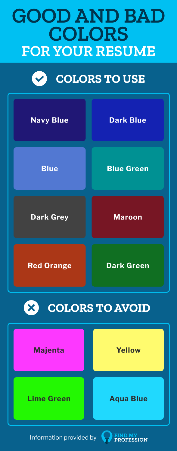
Resume font colors should remain consistent throughout your resume and we recommend never using more than two unique colors (i.e. red and blue).
Below are some good and bad colors to use on your resume:
Where to Add Color to Your Resume
If you are thinking about adding color to your resume, it’s important to have some consistency with the places you are adding color.
The purpose of adding color to your resume is to help key sections stand out.
Job titles, company names, headers, and subheaders are the most common places that people add color to their resume.
You might also consider adding color to the bullet points on your resume to match the overall theme (see sample below).
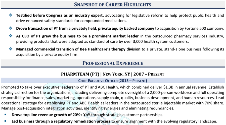
Take a look at Find My Profession’s resume samples for more ideas on adding color to your resume.
What About the Cover Letter Font?
Your cover letter design should match your resume design.
It’s best for your cover letter to use the same color schemes, font sizes, and font types as your resume.
This creates a uniformity that hiring managers appreciate and also makes it easier to know that your resume and cover letter belong together.
Use any of the recommended font sizes, colors, and types mentioned above and your cover letter will be a cut above the rest.
Key Takeaways
When it comes to resume font, size, and color, there is no one size fits all. You can use a variety of resume fonts and still have an amazing resume.
Here’s what you should remember:
- Acceptable resume fonts include Calibri, Cambria, Garamond, Helvetica, Georgia, Tahoma, Verdana, Trebuchet MS, and Book Antiqua.
- Bad resume fonts include Times New Roman, Courier, Comic Sans, Papyrus, Impact, Futura, Lucida Console, and Arial.
- Add professional colors to your resume to help key sections stand out.
If you don’t want to worry about any of this, you can use a professional resume writer. They know the ins and outs of resume formatting and can take care of it for you! Check out Find My Profession’s resume writing services for more information.
Recommended Career Advice For You

10 Best Outplacement Services in America (2024)

How to Stay Positive and Motivated During the Job Search Process

Outsourcing Your Job Search: Pros and Cons of Reverse Recruiting
The Best Fonts for Your Resume in 2024, According to HubSpot Recruiters
Published: April 24, 2024
Besides your content, using one of the best fonts for resumes may help you get a recruiter’s attention. Studies have shown recruiters typically scan a resume for six to thirty seconds before deciding if an applicant is fit for a role.

With only a few seconds to demonstrate your qualifications for a position, every detail counts — including the font you use. The question is, what are the best resume fonts to pass the six to thirty-seconds scan?
![resume font and size 2022 → Download Now: 12 Resume Templates [Free Download]](https://no-cache.hubspot.com/cta/default/53/4ec95757-585e-40cf-9189-6b3885074e98.png)
I asked HubSpot recruiters to reveal the seven best fonts for your resume and what they consider in terms of design so your resume can stand out in a pile.
Table of Contents
What is the best font for a resume?
Expert advice on choosing the right font.
- Top 7 Best Fonts for Resumes
- Does Using The Best Resume Fonts Even Matter?
- Worst Fonts for Resumes
- Ideal Resume Font Sizes
Resume Font Tips
Choosing a resume font: faqs, featured resource: 12 free resume templates.

Download Now
Here’s a hot take — I don’t think there is one best font for a resume.
I think most folks would lean toward Times New Roman or Calibri, but there are so many factors that go into choosing a font that works best for you.
- What industry are you in? Certain industries, like law, have font standards, so it’s not a bad idea to align your resume accordingly.
- Is your resume text-heavy? Some fonts work better in smaller sizes and in tighter formats than others.
- What’s the company culture like? Times New Roman might be a great fit for lawyers, but it might not be the best choice if you’re joining a company with more of a relaxed vibe.
So, my non-answer is … it depends.
If I absolutely had to pick my favorite, I’m going with Helvetica because it’s clean, simple, and easy to read (even in smaller sizes). Plus, it’s available on most, if not all, devices.
But don’t take my word for it. Let’s hear what the experts have to say.
To evoke a sense of style, professionalism, and uniqueness, you must put effort and consideration into your font choice. When speaking with recruiters, it quickly became apparent that classic fonts are still the best options.
“I’m a big fan of the 'classics' for resumes — Times New Roman, Arial, Calibri, Helvetica, and Cambria. I’m a little old school, but I think they are the cleanest and exude professionalism,” said Johanna Fleming , a former senior recruiter at HubSpot.
Riley Kundtz , the former senior MBA campus recruiter at HubSpot, agreed.
“I find the classic formatting and Times font helpful when reading a dense resume from an experienced MBA candidate.”
Times New Roman has become a bit controversial lately. It was the go-to font for many years because it’s traditional and recognizable, but lately, some are opting against it.
“For me, it’s all about legibility and cleanliness. I prefer sans-serif fonts like Helvetica, which is modern and elegant, over serif fonts like Times New Roman,” says Glory Montes , a technical recruiter at HubSpot.
“Overall, I would just stay away from a font like Times New Roman; it’s overused and reminds me of long nights writing course papers in college,” adds Glory.
Georgia is one font The New York Times uses and is similar to Times New Roman. It’s a bit wider, making it easier to read.
.png)
12 Free Customizable Resume Templates
Fill out this form to access your free professionally-designed templates, available on:
- Microsoft Word
- Google Docs
- Microsoft PowerPoint
- Google Slides
Download Free
All fields are required.
You're all set!
Click this link to access this resource at any time.
Paulina Valdez Franco, former executive recruiter at HubSpot, agrees with this take.
“My two favorite fonts are Helvetica if you're looking for a clean and classic look, and Georgia, if you want a more modern and fun look,” she said. “The latter is also designed to read well on screens.”
Helvetica is widely used in advertising and works equally well for text-heavy pages and documents.
A lesser-known font that’s a great option for your resume is Garamond, recommended by our former team lead of engineering recruiting at HubSpot, Rich Lapham .
“Recruiters have an idea of the skills they are looking for on a resume, so if you try a new style or format, it can be tougher for recruiters to find the information they are looking for,” he said. “Keep it clean and simple.”
Franco added that Arial and Calibri are great choices to play it safe.
Bridget LeMon , HubSpot's global emerging talent and university recruiting senior manager, echoes this.
“It's totally acceptable – and becoming more common – for candidates to stray away from the resume norms of Times New Roman and Calibri,” she said.
“Avenir Next and Muna are two excellent font options if you are looking to break the status quo.”
Ultimately, you‘ll want to consider the position you’re applying for when choosing a font. To Glory Montes’ point, certain more creative roles might benefit from a unique font than Times New Roman.
The Best Resume Fonts
- Times New Roman
- Avenir Next
Best Fonts for Resume
1. Times New Roman
Times New Roman font has been popular for resumes for decades.
This serif option is easy-to-read and communicates formality. Online, the font is uniform and accessible across various platforms and operating systems.

Best for: Word documents. PDFs can host unique fonts. However, a standard font will be helpful if your resume is uploaded as a Word document.
- It has a classic and professional look, making it an excellent choice for applicants targeting corporate positions.
- It’s a standard font used in most word processors, making it an accessible option for any device.
- It’s easily readable in print and on-screen.
Disadvantages
- Times New Roman’s outdated look may not appeal to all industries, and some may consider it bland or generic.
- This font may make your resume blend in with the rest due to its ubiquity.
- It’s a heavy serif font, taking up more space than other options.
Arial is a sans-serif font that has become popular for its clean and modern look.
Arial's straightforward and minimalist design has made it a popular choice for applicants targeting creative positions.

Best for: Resumes submitted online, where readability is essential for Applicant Tracking Systems (ATS) used in recruitment.
- Arial offers simplicity, which allows your content to stand out.
- It has strong legibility in small font sizes, even in print.
- It’s ideal for applicants trying to fit all the necessary information in their resume on a single page.
- The font's overuse in branding and design has led to its association with a non-innovative style.
- Arial's uniformity may not suit industries such as graphic design or creative writing seeking to showcase creativity and flair.
- It may make the text appear less formal and inappropriate for specific job applications.
3. Avenir Next
Avenir Next is a modern typeface gaining popularity among designers and recruiters. Avenir Next's appearance is characterized by its geometric shapes, open contours, and strong lines.
Its clean, contemporary look has become a popular font choice for resumes.

What I love: Avenir Next is a scalable font. It maintains its readability even at small sizes, and its geometric shapes make it a perfect choice for digital resumes.
- Avenir Next's sleek and modern design makes it an excellent choice for applicants targeting creative industries.
- Its clear, simple lines offer a sense of elegance, while its legibility gives recruiters a sense of professionalism.
- Avenir Next may not be as widely recognized.
- It could be difficult to read on some computer systems without the font installed.
- It’s a premium font with a higher price tag.
4. Helvetica
Helvetica is a widely recognized and popular font used on resumes, particularly in the design industry.
It’s clean, classic, and timeless. This font is popular with professionals, design enthusiasts, typographers, and Wes Anderson.

What I love: The font is available in multiple weights, making it easier to differentiate headings and sections in the resume.
- Helvetica is easy to read and has a professional, straightforward appearance.
- The font‘s popularity means that job recruiters and hiring managers are familiar with it.
- Helvetica’s clean lines give the resume a structured and well-organized look, making it ideal for those in finance, law, and business management.
- The font's ubiquity in resumes may make it feel overdone and uninspired.
- With so many applicants using the font, your resume may struggle to stand out.
- Helvetica‘s minimalist design can also work against you if your resume has limited content.
Calibri is a contemporary design, making it a popular choice for creating a visually appealing and easy-to-read resume.

What I like: Calibri offers a sense of uniformity across different platforms, making it an accessible and reliable option for applicants.
- The font has been designed with legibility in mind, making it an excellent option for resumes.
- Calibri's modern look creates a sleek appearance, making it ideal for job seekers looking to highlight their contemporary skills.
- Calibri is also lighter than other font options, making it an ideal choice for single-page resumes.
- Calibri is one of the default fonts available in most word-processing programs, so it’s not unique or personal.
- The font can be perceived as informal, making it less than ideal for formal industries, like law or finance.
Cambria's classic design features elegant serifs, making it a perfect choice for job seekers. You can easily create a traditional, professional-looking resume that stands out.

What I like: Cambria's generous spacing between characters and lines makes the resume much easier to read and stands out from other fonts.
- Cambria has a classic yet modern appearance.
- The font‘s serifs give it a timeless look that is perfect for job seekers in more traditional industries such as finance or law.
- It’s highly readable, even in smaller font sizes, which makes it an excellent choice for information-heavy resumes.
- Some recruiters and hiring managers might view the font as old-fashioned or generic.
- Cambria's heavy serifs may be problematic for those trying to keep their resume to a single page.
Georgia is a traditional serif font that has been a popular choice for resumes due to its elegant and classic look.
Georgia's unique design features distinguishable serifs that give it a professional appearance.

What I like: The font's design combines traditional and modern aesthetics, making it a versatile option for job seekers applying for a wide range of positions.
- Georgia's design is easy to read even in smaller font sizes, making it a perfect choice for resumes with limited space.
- It can be customized, which makes it an excellent option for applicants looking to add their personal touch.
- The font's traditional appearance may not be suitable for applicants targeting creative or non-traditional fields.
- It’s a serif, making it difficult to read in small sizes on a digital screen or in online applications.
Fill out this form to access your free professionally-designed templates.
Does using the best resume fonts even matter.
Most recruiters I spoke with were hesitant to offer a font. Instead, they focus on the content.
“I rarely pay too much attention to fonts,” said Heta Patel , a former HubSpot recruiter. “I'm more concerned to see a resume that’s formatted neatly – submitting a PDF is helpful with this, so your formatting doesn't shift.”
Sales Recruiting Manager Kelsey Freedman agreed.
“Honestly, I care little about the font of a resume, as long as it's clear and in PDF format," Freedman said. "I typically review a resume for 20 to 30 seconds, so a traditional font is good."
Freedman continued, "I would advise avoiding script font or bubble font, or similar fonts that are distracting.”
Ultimately, and as expected, your content still matters most. However, a clear font will help avoid any irritability you might cause a recruiter with a distracting, messy design.
“What I get most excited about is the content. Depending on the role, I look to see that candidates are sharing direct and compelling snapshots of their work,” said Ashley Hodder , a global recruiting manager at HubSpot.
“I look for indicators that show data orientation, autonomy, and thoughtfulness about business impact,” she said.
Worst Resume Fonts
While some recruiters may not have suggestions for the best fonts, many can agree on some of the worst ones.
“Anything that is cursive or too bubbly is too hard to read. For instance, I'd stay clear of Comic Sans,” says Holly Peterson , team lead for management and research recruiting HubSpot.
Another resume font type to avoid is Script.
With text-heavy documents, Scripts, and any of their derivatives make text hard to read because they look like they’re written by hand.
They’re generally used in hand lettering and calligraphy for artistic projects and shouldn’t be present anywhere near your resume.
Ideal Resume Font Size
When asked which font size is best, Fleming said 12 is ideal. Most recruiters would agree.
Your text should be large enough to read comfortably without straining but small enough that there’s space to include all key elements, such as your objective, contact information, skills, and experience.
You can use larger font sizes for headings containing your name and section titles.
If your font is extensive, you can scale to 10.5 — but never go below it.
The critical takeaway is to make your resume clear and easy to read, which means keeping the font size around 12, sticking to classic fonts with modern twists, and forsaking your favorite script font.
1. Choose a font that’s best suited for your industry.
It’s important to keep industry nuances in mind as you’re writing.
For example, a seasoned graphic designer wouldn’t dare use Comic Sans. And the standard font for most legal documents is Times New Roman.
This is not to say your resume font will make or break your chances of getting the job. But this small step can help demonstrate your attention to detail and your experience in the field.
Pro tip: Whenever I’m refreshing my resume, I like to browse examples in my industry for inspiration. It helps me make sure that I’m aligning the overall style with the position I’m applying for.
This is especially useful when I’ve been out of the job market for a while.
2. Keep the font consistent throughout.
Font consistency is just as important as font type and size. It can be confusing for recruiters if you’re switching back and forth between fonts.
And as I mentioned, you have about 30 seconds tops to make an impression. Make your resume scannable and easy-to-read at a glance.
Pro tip: If you’re going to mix fonts, at least make sure all text levels are the same throughout. For example, all titles and headers should be the same, and all paragraph fonts should match.
3. Be mindful of contrast and colors.
It’s fun to introduce colors into your resume — whether it’s background colors or adding some flare to your titles and headers.
But the most important part is readability. Don’t get carried away with bright or busy colors. You’ll end up taking away from the content on the page.
Pro tip: You can use a color contrast checker to make sure your resume is accessible and legible.
4. Pay attention to formatting.
Similar to font consistency, you’ll want to make sure your resume is well-formatted and organized.
Use headers to break up your sections, make sure your margins are at least half an inch on all sides, and use a font type with optimal clarity.
Recruiters get thousands of resumes per job listing. Make sure your resume catches their eye for good reason — not bad.
Pro tip: Just because your resume looks good on your computer, doesn’t mean it’ll look good on all computers. Save and send your resume as a PDF to ensure the formatting stays constant wherever it goes.
1. Should I choose a serif or sans-serif font for my resume?
This decision largely depends on the type of job you’re applying for and the contents of your resume.
While there’s no right or wrong answer, here’s a helpful cheat sheet:
- Serif fonts are classic and professional. They work best for multi-page or light-text resumes and traditional fields (e.g., law, finance, business).
- Sans-serif fonts are modern and sleek. They work best for single-page or text-heavy resumes and creative fields (e.g., marketing, design).
2. What size should my resume font be?
Size 12 is the ideal font size for a resume.
You can go as low as 10.5 if you have a lot of information to include, and I wouldn’t recommend going larger than font size 14.
However, you can go larger than 14 for headers and section titles to help organize your sections (i.e., Education, Experience, etc.).
Happy Resume Writing
Editor's note: This post was originally published in November 2018 and has been updated for comprehensiveness.
Don't forget to share this post!
Related articles.

What Are Good Weaknesses to Say in an Interview That Aren’t “I’m a Perfectionist”?
![resume font and size 2022 How to Write a Letter of Recommendation [+ Free Template]](https://knowledge.hubspot.com/hubfs/1-Jun-11-2024-04-43-53-9263-PM.png)
How to Write a Letter of Recommendation [+ Free Template]
![resume font and size 2022 Get Past the ATS With These Resume Templates [+ Tips]](https://knowledge.hubspot.com/hubfs/atsresume.webp)
Get Past the ATS With These Resume Templates [+ Tips]

Is it Worth Using ChatGPT to Write Your Resume? Let’s Find Out
![resume font and size 2022 How to Write a Respectable Resignation Letter [+ Samples & Templates]](https://www.hubspot.com/hubfs/resignation-letter-template.webp)
How to Write a Respectable Resignation Letter [+ Samples & Templates]

Quiet Quitting vs. Setting Healthy Boundaries: Where's The Line?

How to Answer ‘What Makes You Unique?’ & Stand Out in Your Next Interview

Best Personal Website from Marketers, Creators, and Other Business Professionals Who’ll Inspire You

#OpenToWork: Are LinkedIn Photo Frames Actually Helpful?
![resume font and size 2022 What is a Letter of Intent? How to Write One for a Job [+ Examples]](https://www.hubspot.com/hubfs/image2%20%282%29.webp)
What is a Letter of Intent? How to Write One for a Job [+ Examples]
Resume templates to create a killer resume for your job application.
Marketing software that helps you drive revenue, save time and resources, and measure and optimize your investments — all on one easy-to-use platform
- Resume Tips
The Best Fonts and Size to Use on a Resume (Updated 2024)

12 min read

Finding a job is tough these days, with steep competition and hundreds of applications per open job listing. That’s why your application has to stand out from the crowd.
You want every aspect of your resume and cover letter to convey that you’re the best fit for the job. After you’ve considered your experience, skills, education, and qualifications, you have another choice to make: what is the best font to use for your resume?
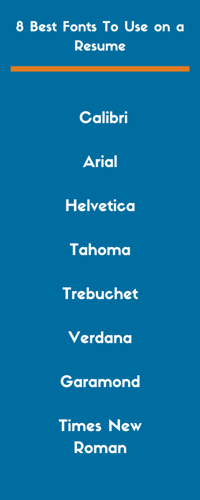
Your resume font is one of those things that can either support your message (I’m perfect for this position!) or send the wrong message (I’m too old/too young/too out of touch for this job). In this guide, we share the inside secrets. We’ll give you the 8 best fonts to use on your resume and how you can choose the right fit for your resume.
Times New Roman
The best fonts for resumes ( video )
Font selection is an important part of your resume creation because it sets a tone for your whole document. You can use different fonts for the body and the headings, but you don’t want to use more than two.
The fonts listed above – and detailed below – are all good, clean font choices. Of course, any font with too many flourishes risks being illegible to the ATS ( applicant tracking system ). So you want to avoid them at all costs. In short, you want your ideal resume font to come across as professional, not detract from your message. Luckily, we have you covered. Let’s take a look at the best fonts for a resume below.
ZipJob's blog includes hundreds of articles on career resources, resume writing, and the job search written by career experts.
Calibri takes number one on our font list and has really gained popularity lately. It’s one of the best fonts for resumes as it’s clean and clear. This one is professional and more modern-looking than some other fonts, making it a great font to use on both a resume and cover letter.
Lucas de Groot, the creator of the Calibri font, described it as having “a warm and soft character.” Microsoft also has Times New Roman with Calibri as the standard font for Word and other applications.
Calibri is clear and easy-to-read. That means that it’s ideal for your next resume. The hiring manager will have no problem quickly scanning the content of your application.
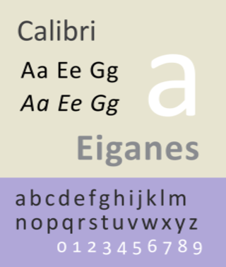
Arial is another great font to use on your next resume. It’s part of the popular sans-serif font family. Many people have said that Arial is one of the easiest to read. As if that wasn’t enough, it also has a more modern look to it than other fonts.
Looking for some more information? Here is a good description of Arial from Wikipedia :
“Arial contains more humanist characteristics than many of its predecessors and as such is more in tune with the mood of the last decades of the twentieth century.”
Arial is one of the best fonts for resumes. The sans-serif typeface is simple yet effective. If you don’t want your font to detract from the content of your resume, use this font.
3. Helvetica
Next up, it’s one of the most popular fonts in the world. Helvetica is an excellent sans-serif font you can use for your resume. Helvetica is very similar to Arial and requires close inspection to really tell the difference. It, too, offers a clean and modern look that’s easy on the eye. It also comes in a variety of weights and styles.
Also a sans-serif font, Tahoma has a more modern look than the rest of the fonts listed. It was used by Microsoft for many years for a variety of different programs. While it is not as popular as the likes of Arial and Helvetica, it’s still one of the best fonts for a resume.
Tahoma is a great option that gives your resume a kick while still appearing professional. Try this one when you want your application to stand out.
5. Trebuchet
Trebuchet is another san-serif font, created by Vincent Connare. His goal with Trebuchet was simple: to create a font that appeared well on a screen and also provided a contrast in texture to Verdana, which is next on our list.
Trebuchet is a great option since it was designed to appear well on a screen which is how most employers will view your resume. It also provides a modern kick compared to other traditional fonts on our list.
Verdana is another sans-serif which looks ace on a resume. It was designed in 1996 by Mathew Carter, who worked for Microsoft. Verdana was created to appear well on a small screen as well as screens with low resolution.
Verdana is a good font choice to use on applications. It is a simple typeface that is spaced perfectly, making it super easy for anybody to read.
7. Garamond
Garamond is a collection of old-style serif fonts created by 16th-century French engravers. Although it is a good choice, it may seem a bit stale and outdated to some. If you have a lot of experience, it may be a good choice.
Example: Garamond is a classic font that is suitable for some types of resumes. If you are applying for a highly traditional role, you may find that this font style gives your application a classic look.
8. Times New Roman
This is probably the most debated font when it comes to resume writing. Times New Roman is a classic serif typeface that may be a bit too overdone for a resume. Although no hiring manager will dismiss your resume because you used Times New Roman, it may not stand out as well as the other fonts on our list.
Times New Roman may be a bit too “classic” when it comes to making your resume stand out. It is still an acceptable font to use, especially for those who want to go with a traditional look.
Times New Roman is a classic for print that you see in many types of media, including newspapers and books. However, resumes are now often viewed on computers or mobile devices. Sans serif fonts (such as the one we use on this website!) are easier to read on a computer screen. it may help you make your font decision if you know whether or not your resume will be read on paper or on a screen.
8 best fonts to use on a resume (graphic)

Bold and italic font: When to use it
Now that you know what the best fonts to use are, let’s talk about one crucial point. When should you use bold and italic fonts? You don’t want to go wild when it comes to adding extra character to your text. Here’s a breakdown of when you can use each of them:
It’s not wise to bold any text within the main body of your resume. That includes your summary and any bullet points you include. However, you may want to use the bold feature when you are adding information, such as your contact details in the header.
Italic font
Resist the urge to italicize words that you want to emphasize. That can look chaotic. Instead, you can use italic font when you’re including certain details, such as your years of employment or the year you graduated. When and where you use this font will depend almost entirely on the overall style of resume that you choose to use here.
How to choose the font for your resume
Trying to decide which font to use? Let’s go over some factors to keep in mind when choosing a resume font for your next application.
1. Resume readability
Readability is, far and away, the most important thing to consider when choosing a font. It sounds obvious but you’d be surprised how many people completely mess up on this one.
If readability is your only concern, any basic serif or sans serif font will do the trick. It’s also extremely important to avoid those comic-looking childish fonts at all costs.
Some fonts were designed to look better on a screen, while others look better when printed out. Think about who is viewing your resume and how they are likely to view your resume. You should be able to use your own judgment to determine readability.
2. Resume font size
We’ve been so intrigued by font styles that we almost forgot to talk about the size. But it matters more than you might imagine. Too big or too small, and you could ruin your chances of success. Generally, you should use a font size between size 10 and 14.
However, it is very important to realize that some font styles run bigger and some run smaller. For that reason, it’s important to make a judgment on the font size after you’ve already decided on a style. That way, you can make sure that it’s legible.
Your goal is to maximize the ease of reading your resume without making the text look overly bloated. Of course, you’ll have to use your best judgment when deciding if it looks bloated. But, if you stick to fonts smaller than 14 points, you will be fine in nearly every scenario.
There’s one exception: your name. Your name is often the largest font size on your resume, with good reason – you want it to stand out and stick in your readers’ minds! This part can be about twice as big as the other section headings of your resume .
Another important thing to keep in mind is the font size effect on resume length. Obviously, the size of the font can dramatically change the length of your resume – you should always use this to your advantage.
For example, say your resume is just a line or two over a single page or just a few lines away from filling a full page. Adjusting the font just one-tenth of a point can make the text fill out the rest of a page or prevent it from spilling over into the next one. These slight adjustments can work wonders in making your resume more aesthetically pleasing.
3. Purpose of a resume
Font styles can change the entire feeling of a resume. Remember the message you want to convey with your resume. When you take a quick glance at it, does it convey the purpose you want it to? Does it suit the field to which you’re applying?
Does it look like the resume of an old, seasoned veteran? Or, does it look like it is representing a young professional? A recent college grad?
We don’t mean to suggest your resume font is going to manipulate people into thinking you are something you are not. Just like a piece of art can induce certain feelings, so can a good resume. A great font selection will pop out immediately. It should give hiring managers and recruiters an idea of who you are and what your purpose was for writing the resume they see before them.
Compare these versions of the same resume:
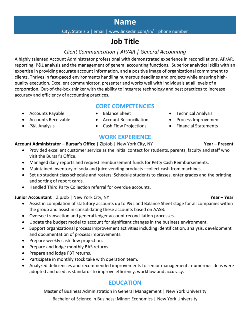
Fonts you should never use on a resume
We hope it goes without saying but absolutely do not use Comic Sans or any similar “fun” font on your resume. It will make you stand out, but not in a good way. It’s so childish that it will convey to the employer that you’re out of touch with the professional world.
Just in case you’re not sure what font-type we’re talking about, here are a few examples:
Wingdings (Wingdings)
Avoid using the above under any circumstances. Not for headings, not for symbols, and definitely not for your name. Keep it professional. Just for comparison’s sake, here is the resume we used above with a Comic Sans font.
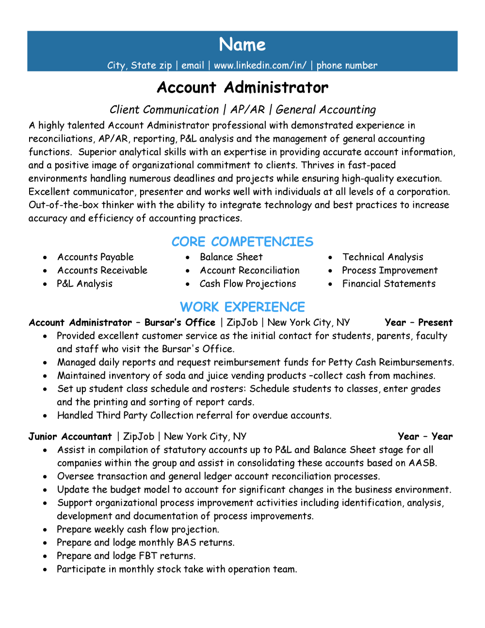
As you can see here, the font looks immature and the content doesn’t fit on a single page anymore. The work experience is completely overridden by the unprofessional font choice. This will most likely get your resume tossed out of hand. Say it one last time: You should never use Comic Sans for your resume, cover letter, or any professional communication.
Can you combine fonts on your resume?
The short answer is yes! Most resume templates include a couple of font styles. However, you need to ensure that these fonts work with one another. As a general rule, it is safe to choose one font (perhaps a serif font) for headers and one (maybe a sans-serif font) for the finer details. There are many exceptions to this rule, though. When you are creating the design of your resume, you have to consider how the entire document looks, after all.
The font you choose for your resume is important. You want to strike the perfect balance of uniqueness, class, and professionalism. Keeping these things in mind when choosing a font can be the difference between a call-back and radio silence.
Remember that the “perfect” resume font is subjective. While you should certainly select a font that doesn’t distract from your message, having a well-written resume is more important. While drafting your resume, keep these factors in mind. You’ll be on your way to the next interview in no time!
Ready to take the next step in your career? To make sure the content and format of your resume are ready for online applications in 2024, check out our free resume review tool . It’s always worth giving yourself the competitive edge.
Recommended reading:
3 fonts to never use on a resume
How to choose the right font
Resume font size
Charlotte Grainger, Editor & Content Writer, Charlotte Grainger, Editor & Content Writer
Charlotte Grainger is a freelance writer living and working in Sheffield, UK. She has a passion for career development and loves sharing tips and advice. Follow her on Twitter
Is your resume working?
Find out with a free review from ZipJob.
Get a free resume review today
Our experts will review your resume’s grammar, layout, and ability to pass ATS — all free and delivered straight to your inbox.
PROTECT YOUR DATA
This site uses cookies and related technologies for site operation, and analytics as described in our Privacy Policy. You may choose to consent to our use of these technologies, reject non-essential technologies, or further manage your preferences.
The Top 10 Best Fonts For Your Resume
Customers Interviewed by:
Agonizing over the best font for your resume? It might seem like a tiny detail, but choosing the best font for your resume can be the difference between a resume that’s skimmed versus one that’s read thoroughly.
This post will provide examples of each font in action as well as their pros and cons. You’ll also find essential formatting tips to ensure your resume is both visually appealing and ATS-friendly .
ATS stands for applicant tracking system . This is the computer software that most companies use today to filter, organize, and file resumes. It’s important to use a font that the ATS can easily read or the information on your resume might get jumbled.
What font is best for a resume in 2024?
Jobscan recently tested some of the leading ATS. We found that using standard or common web fonts is the best option when creating your resume. Some ATS have trouble reading unusual or unique fonts.
The top 10 resume fonts for ATS:
- Times New Roman
What’s the difference between serif and sans serif?
Fonts fall into two main categories: serif and sans serif.
Serif fonts have small decorative lines or ‘feet’ at the ends of their letters, giving them a classic and traditional feel. These tiny projections can make text easier to read in print.
Sans serif fonts lack these embellishments. Their clean design offers a modern and streamlined appearance, often preferred for on-screen reading.
Whatever font or font size you choose, you should always print a test page or view your resume on different devices to ensure it looks right across various mediums.
To avoid font and formatting mistakes , try using a resume builder. Jobscan’s resume builder is free and comes with a variety of ATS-friendly templates. Just fill in each field and the resume builder will automatically format your information using a professional font.
The top 10 best fonts for your resume
Calibri is a modern sans-serif typeface that became the default font for Microsoft Word in 2007. Its clean design, combined with rounded edges and a warm appearance, makes it highly legible both on screen and in print.

Pros : Calibri’s sleek design gives documents a contemporary and professional appearance. It’s easy to read on both digital displays and in print.
Cons : Being the default font for Microsoft Word, Calibri can be perceived as generic or lacking originality.
Here’s what the Calibri font looks like on a resume:

Introduced with Microsoft Office in 2007, Cambria was specifically optimized for on-screen reading and to look elegant when printed at small sizes.

Pros : Cambria strikes a balance between contemporary and classic. This makes it suitable for a wide range of professional documents, both in print and digital.
Cons : Some might find Cambria too neutral or generic for creative or design-focused projects.

Created in 1993 for Microsoft Corporation, Georgia is a serif typeface designed to be read on computer screens. Georgia’s versatility and readability have made it a staple for web content, articles, and professional documents.

Pros : Georgia’s clear character design ensures that it remains readable even at smaller sizes, both on screen and in print.
Cons : Given its popularity and widespread use, especially on the web, Georgia might be perceived as a standard or generic choice.
Here’s what the Georgia font looks like on a resume:

4. Helvetica
Helvetica is so popular that on its 50th anniversary, a documentary film was released chronicling the font’s use in modern design. It has a reputation for representing corporate branding, making it a great choice for corporate candidates.

Pros : As one of the most iconic fonts, Helvetica has a timeless quality that remains modern and relevant, even decades after its creation.
Cons : While Helvetica is a standard font on Macs, Microsoft Windows does not include it. Instead, Microsoft provides Arial, which is similar to Helvetica.
Here’s what the Helvetica font looks like on a resume:

Commissioned by Microsoft, Arial was created as an alternative to the popular Helvetica font. Characterized by its clean and modern design, Arial has become one of the most widely used fonts for both print and digital media.

Pros : As a default font in Microsoft Windows, Arial is widely recognized and compatible across many platforms and devices.
Cons : While Arial was designed as an alternative to Helvetica, some designers believe it lacks the subtle design nuances that give Helvetica its iconic status.
Here’s what the Arial font looks like on a resume:

6. Times New Roman
Times New Roman is a serif typeface designed in 1931 for The Times of London. It quickly gained popularity beyond newsprint, becoming a standard font for book publishing and academic papers. Some may claim Times New Roman is outdated, but it remains one of the commonly used fonts today.

Pros : Times New Roman allows for a good amount of text to fit on a page without compromising legibility, making it a popular choice for resumes.
Cons : While it’s optimized for print, Times New Roman might not always be the best choice for digital platforms, where sans-serif fonts often prevail for clarity and legibility.
Here’s what the Times New Roman font looks like on a resume:

7. Garamond
Garamond is a classic serif typeface designed in the 16th century. Its remains a popular choice for book printing, branding, and a wide range of print materials.

Pros : Garamond is a space efficient font. It uses less horizontal space compared to other fonts.
Cons : While Garamond is optimized for print, it might not always be the best choice for digital platforms where sans-serif fonts are often favored for clarity and legibility.
Here’s what the Garamond font looks like on a resume:
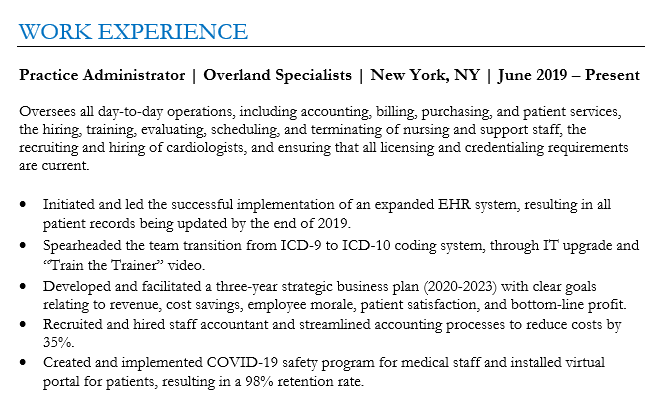
8. Palatino
Designed in the 1940s, Palatino has a classic and timeless quality that evokes a sense of tradition and sophistication. It works as a great alternative to Times New Roman for those who have grown tired of the more generic font.

Pros : The Palatino font works well in both print and digital media. It’s commonly used in books, magazines, and websites.
Cons : Palatino’s bold version might not have the same visual impact as other typefaces.
Here’s what the Palatino font looks like on a resume:

Tahoma is a sans-serif typeface designed in 1994. It was specifically created to be legible on computer screens. Tahoma has a technical feel to it and is a great option for engineers.

Pros : Tahoma remains clear and readable even when used at small font sizes.
Cons : Tahoma’s frequent use in Microsoft’s products and operating systems can make it feel overused and dated.
Here’s what the Tahoma font looks like on a resume:

10. Verdana
Verdana is another Microsoft commissioned sans-serif font. It was developed specifically for improved legibility on digital screens, making it a safe choice for resumes.

Pros : Verdana’s design versatility allows it to be effective in both on-screen and print contexts.
Cons : Verdana’s relatively generous spacing can sometimes lead to more space-consuming layouts when compared to other typefaces.
Here’s what the Verdana font looks like on a resume:

Top 8 formatting tips for an ATS-friendly resume
When you submit your resume, it most likely will go directly to an ATS, or applicant tracking system. The ATS then analyzes your information, organizes it, and stores it in a database.
Hiring managers search through the database for suitable job candidates using keywords , such as job titles or skills.
Problems can arise if your resume isn’t formatted correctly. This can cause the ATS to mix up your information and make your resume hard to find.
To avoid this, pay attention to the following formatting tips. You can also use Jobscan’s free resume builder . It will automatically format your resume so it can be easily read by an ATS.
1) Use a hybrid resume format
There are three basic resume formats . Here’s a brief description of each:
- Chronological – This is the most traditional format, where your work experience is listed in reverse chronological order.
- Hybrid – This format features skills at the top, followed by a reverse chronological work history.
- Functional – Instead of focusing on work history, this format emphasizes skills.
We recommend the hybrid resume format because skills sections are increasingly important in today’s job market. The chronological format is also fine to use.
Try to avoid the functional resume format . Hiring managers don’t care for it because they want to see your work history. It might also cause problems for an ATS.
Whichever format you use, try to add a summary to the top of your resume. This quickly tells hiring managers who you are professionally and what you can bring to the table in a new role.
Read more : How to Write an Effective Resume Summary
2) Avoid non-standard fonts
When selecting a font for an ATS-friendly resume, avoid script, cursive, and decorative fonts. Non-standard fonts like these can be challenging for an ATS to read and may appear unprofessional to a hiring manager.
3) Use proper font sizes
Here’s are some guidelines about the font size to use on your resume:
- 10 to 11 points – This range is suitable for most resumes. It ensures readability while allowing you to fit a good amount of content on the page.
- 12 points – This size is clearer and more readable but might make your resume longer if you have a lot of information to include.
- 14 to 16 points – For headings and your name, you can opt for a slightly larger font size.
Also be sure to use standard resume margins . A standard margin is one inch on all sides.
4) Avoid graphics, logos, and other visual elements
While fancy visual elements can enhance the aesthetic appeal of your resume for human readers, they can sometimes confuse the ATS. ATS are designed to read text, not images .
5) Use bullet points
Bullet points break down complex information into digestible chunks, making it easier for both ATS and human readers to scan and understand your qualifications and achievements.
However, it’s essential to use simple bullet symbols, like circles or dashes. Some ATS might struggle with more intricate symbols.
PRO TIP : Always use strong action verbs to begin each bullet point on your resume.
6) Be consistent in your date formatting
Make sure that the dates of your employment and education sections are consistently formatted. Here are three examples of how to format your dates:
- January 2020 – December 2022
- Jan 2020 – Dec 2022
- 01/2020 – 12/2022
Whichever format you choose, be consistent throughout your resume. Also, don’t just put the year. Some ATS are designed to look for more specific date formats.
7) Avoid unclear abbreviations and acronyms
ATS are designed to scan resumes for specific keywords. If you use an abbreviation or acronym that the system isn’t programmed to recognize, it might overlook crucial information about your qualifications.
If you do choose to use an abbreviation or acronym, introduce it by first writing out the full term followed by the abbreviation in parentheses. For example, “Certified Public Accountant (CPA).”
8) Tailor each resume to the specific job you’re applying for
One of the biggest mistakes job seekers make is only creating one resume that they send out with every application.
Remember, hiring managers search the ATS for suitable job candidates by typing in specific keywords related to the job. These keywords can be found in the job description.
If your resume doesn’t contain these keywords, it will probably be overlooked.
It can take more time and effort to tailor each resume , but you’ll get more job interviews. To speed up this process, consider using a tool like Jobscan’s resume scanner .
Just paste your resume and the job description into the scanner and it will give you a score that shows how closely your resume matches the job requirements. You’ll also see exactly which keywords you should include on your resume to increase your score. Here’s a sample of the report you’ll receive:

In this example, the scanner is telling you to include the keywords “ms office” and “google suite” on your resume. These are the keywords that the hiring manager is most likely to search for in the ATS database.
Having these keywords on your resume will increase your chances of getting an interview – and the job!
More expert insights on this topic:

80+ Resume Accomplishments Examples to Show Your Value

5 Sections You Should Never Leave Off Your Resume

500 Action Verbs to Use on Your Resume Today

Robert Henderson, CPRW, is a career advice writer and a resume expert at Jobscan.
Related Articles

July 29, 2024

July 26, 2024

July 25, 2024

July 23, 2024

July 18, 2024

July 13, 2024
Join 2 million job seekers who get bi-weekly job search tips
Get insider knowledge and ready-to-use job-seeking tips and hacks delivered to your inbox.
- Preparation Tips
- Interview Checklist
- Questions&Answers
- Difficult Questions
- Questions to Ask
Interview Tips
- Dress for Success
- Job Interview Advice
- Behavioral Interview
- Entry Level Interview
- Information Interview
- Panel Interviews
- Group Interviews
- Phone Interviews
- Skype Interviews
- Second Interviews
- Zoom Interviews
- Job Interview Guides
- Administrative
- Call Center
- Clerical Interview
- Customer Service
- Human Resources
- Office Manager
- Project Manager
- Restaurant Jobs
- Social Work
- Interview Follow Up
- Thank You Letters
- Job References
- Employment Tests
- Background Checks
- Character References
- Accepting a Job Offer
- Decline a Job Offer
- Verbal Job Offer
- Negotiate Salary
- How to Resign
- Job Search Strategy
- Job Search Tips
- Respond to Interview Request
- Letters of Recommendation
- Surviving a Layoff
- Sample Resumes
- Resume Objectives
Cover Letters
Job Descriptions
- Job Interview Blog
- Best Articles
Privacy Policy
- Best Font for Resume
The Best Font For Resume - style and size
What is the best font for resume and most importantly, for your specific resume? We look at the best font types for resumes and how to select the right one for you.
Your resume will have about 7 seconds to make the right impression and convince the hiring manager or recruiter to continue reading. Your resume font should be appealing, easy to quickly scan and accessible. The wrong font could see your resume get passed by.
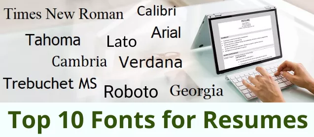
Serif and Sans Serif Font Styles - what's the difference?
Every font belongs to a family of fonts - the 2 main being serif font and sans serif font.
Serif fonts have little "tails" or lines, called serifs, at the end of each stroke in a letter. Sans serif fonts do not have these little decorative tails and are made up of clean, simple lines that are the same throughout.

Serif fonts are more traditional and help convey a formal and serious message. Some consider these fonts as being easier to read as the little tails on each letter can help you to compute what you're reading a little bit faster.
Sans serif fonts are considered more modern and contemporary-looking, providing your resume with a fresher look. They are generally less formal than serif fonts and provide a minimal and simplistic look.
The 10 best fonts for resumes fall into both serif and sans serif categories. When selecting the right resume font the main criteria are legibility and accessibility.
The reader experience is all important - your resume should be easy to read to survive the seven-second scan. Further considerations when selecting the best font for resume are :
- whether your resume is going to be read in a print version, on a computer screen or on a mobile device - certain fonts read better on different devices or in print.
- the industry you are in and the type of job you are applying for - different professions may be best reflected by different resume fonts.
The top 10 best font types for resumes are listed with the advantages for each style clearly and concisely outlined. Find the most appropriate font for your resume from the many font styles on offer.
Top 10 Best Fonts for Resumes

Calibri, a sans serif font, replaced Times New Roman as the Microsoft Office default font which makes it familar to the eye.
Why it's a good choice:
- professional- looking
- easily readable
- renders correctly and well on computer screens when your resume is opened
- its tight layout means it works in a range of text sizes and helps keep your resume to a manageable length
- modern, clean and simple
- described as a warm and gentle font by its designer, Lucas de Groot
Calibri works well for most resumes and particularly for jobs in:
- nursing and care-related professions
- social work and other support-type jobs
- engineering and jobs that have a lot of technical detail as it is functional and familiar and allows more text on the page while still looking clean.
Calibri may be a little too safe and familiar for highly creative jobs or for a more quirky company.

Cambria is a serif font and was designed by Microsoft for easy on-screen reading and to look good when printed at small sizes.
- performs well on computer monitors and for on-screen reading including smaller screens
- the sturdy letter construction means it is easy to read in smaller text sizes
- designed to be easy to read when printed out
- slightly less formal and considered more "friendly" than other serif fonts such as Times New Roman
Cambria works well for jobs in:
- finance and accounting
Although considered less formal than some serif fonts it is still a traditional font and may not be the best font for a resume and job applications in more contemporary and unconventional industries.

Georgia is another serif font that is recommended for its easy on-screen reading and is available on almost all computers.
- it has the classic serif elements but also contains contemporary elements
- clean and crisp looking
- created for clarity on computer screens and reads well even on low resolution screens and a variety of screen sizes including mobile devices
- considered a little more "fun" than other traditional fonts
- allows you to create a resume look that is professional and elegant but also trendy
Georgia works well for jobs in:
- writing, blogging and editing
Georgia's strokes are a little thicker than other fonts and so it may not be the best font for a resume if you are struggling to keep your resume to a certain size.

Verdana was created for Microsoft as the sans serif sister to Georgia. The font was designed so that it is easy to read in small print on screens.
- a clean and modern font, it's easy to read because of its wider spacing
- renders well on a small screen such as a mobile device

Helvetica font is a modern, sans serif favorite considered by many to be the king of fonts! However, it only comes preloaded on Apple computers so you have to purchase it if you don't use a Mac. Arial is a good alternative as it very closely resembles Helvetica. Arial is the default font for Google Docs and a standard font for MS Word and will display correctly on most computers.
- modern and clean lines
- clear, simple and easy to read
- renders well on computer screens
Arial is a safe choice for most resumes and particularly for :
- administrative jobs
It is one of the most used fonts and its generic quality may be considered too bland for jobs in creative industries or trendy companies.

A good sans serif alternative to Arial, Trebuchet renders well on screens and is not as over-used.
- a friendly and rounded font with a modern look
- described by Microsoft as having "energy and personality"
- easy to read
- designed for use on screens and renders well on smaller screens such as mobiles
- works well at both header and body copy sizes
Trebuchet is a good resume font choice for jobs in:
- entry level jobs where its wider body helps fill up the resume page and its style conveys enthusiasm and energy
It is a wider font than Calibri and others and may not be suitable if you are struggling to manage the length of your resume and need a tighter layout.

Tahoma is another san serif font that has a more modern look.
- professional yet a contemporary and trendy style
- strong lines make for easy reading
- renders well on screen
- narrow body and tighter spacing allows for more text on a resume page without losing readability
Tahoma is a good resume font choice for technology-focused jobs as it is works well with detail-heavy resume copy.

Lato and Roboto are two sans serif fonts that are not resume classics but are worth exploring as more modern and less-used resume fonts.
Lato and Roboto have the following advantages:
- professional and serious looking but the semi-rounded details convey warmth and a friendly feel
- easy to read and approachable
- not as over-used as some of the more common fonts
- different enough to stand out but sufficiently corporate to still be professional
Lato and Roboto won't be installed on all computers and your resume might not show up properly as a Word file. If you use these fonts make sure you send your resume to PDF format.

A traditional font that may be considered outdated and over-used but still works as a classic and professional resume font. It is a safe and formal font that conveys seriousness.
Times New Roman is best used for jobs in more traditional and conservative industries.
Times New Roman does not display as well on small screens .
Fonts to Avoid
The main consideration in selecting the best font for resume is that it is easily scanned and read.
Some resume fonts are a definite no, and recruiters and hiring manager are unanimous in describing the resume fonts to avoid.
- thin or light fonts can be difficult to read on screen
- fonts that look like handwriting such as Brushscript or Segoe are difficult to quickly scan and read and look unprofessional
- "funky" fonts like Comic Sans look childish and distract from the serious content of a resume
- heavy and bold fonts like Impact are almost impossible to read quickly and accurately and are not recommended even for headings
- font types that mimic type-written letters such as Lucida Console are considered inappropriate and your resume will not be taken seriously

Best Font Size for Resumes
What size should your resume font be?
- the regular font size for resumes is 12 points - this is easy to scan and read in different formats.
- if you are having difficulty keeping your resume to a manageable length (1 to 2 pages for most job applications) you can try making your font 11 points or even 10.5 points. Depending on the resume font style, this should still be sufficiently legible
- if your resume exceeds the maximum length by just a few words or sentences try editing your resume by using synonyms, rewriting sentences and removing unnecessary words to make it shorter rather than using a too-small font size (usually anything less than 10.5 pts)
- avoid increasing your font size to over 12 just to fill up empty space on your resume page.
- larger font sizes are acceptable for headings or subheadings.
To achieve the right balance between resume length and legibility, select a font type and adjust the size to allow the reader to scan your resume quickly and enjoy a good reader experience.
Best Font for Resume - getting past the ATS
Many employers use Applicant Tracking System (ATS) software to record and sort resumes and job applications. These ATS programs do not read certain font types well and using them puts your resume at high risk of being ignored.
Avoid intricate and unusual fonts and stick to the tried and tested resume fonts including those listed in our top 10 above.
The best font for a resume is one that is widely used and will keep your resume as intact as possible as it gets processed through an ATS, and circulated among recruiters and hiring managers on different computers.
Find out everything you need to know about how to create a resume that gets past the ATS.
Best Font for Resume 2023
Consider the 3 main selection criteria when deciding on the best font for a resume today.
- easy to scan and read
- how is your resume going to be read - print, laptop, desktop or mobile
- the position and industry for which you're applying
Certain resume fonts are considered more contemporary and modern-looking including Calibri, Georgia, Verdana and Tahoma. They work well on screens and are less formal than some of the more traditional fonts like Times New Roman.
The modern resume fonts work well in our digital world and in less formal professions and industries. Traditional fonts may be considered more appropriate for conservative professions and industries that expect a high degree of formality.
If the job opportunity is in a creative field than it is acceptable to go with a more unconventional font. However it still needs to be easy to read and render well on screen.
Everyone viewing your resume on a computer will have different fonts installed so it is important to use a universal font that most computers have today. You don’t want your resume font automatically replaced with a substitute that compromises your resume's appearance, readability and formatting.
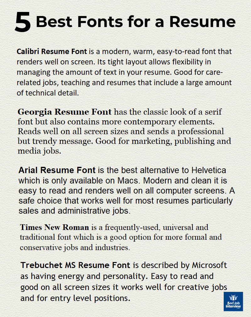
Standard Font Style for Resume and how to use fonts in your resume
The most common standard font styles for resumes are Arial, Helvetica and Times New Roman. However as long as you use a professional, widely accepted and easy-to-read font you will be safe.
There are some basic rules for how to use resume fonts:
- differentiate your headings and section titles from your body copy by tastefully increasing the font size, using bold or using a well matched second font type
- avoid using more than 2 font types in your resume. If you pair fonts, one for heading and one for text, make sure they both are easy to scan and read and do not detract from each other
- avoid multi-colored fonts - it is safe to stick to black text to optimize your resume for readability
- ensure your resume is accessible and easily scanned by including sufficient white space
- use your resume font consistently throughout your resume in terms of size, spacing and headings
- use the same font on your cover letter to keep your application consistent
Over 50 Top Sample Resumes
Everything you need to create a job-winning resume . Sample resumes, resume building tools and resume templates.
SAMPLE RESUMES
Over 50 Sample Resumes
Sample Resume Template
Top Resume Writing Tips
Resume Action Words
Resume Keywords
Resume Reference Page
How to write an impressive resume objective
Sample Resume Objectives
How to Write a Winning Resume Objective
What is the best font for a cover letter ?

Best font for cover letter
How to write a convincing cover letter
Including a powerful cover letter with your resume greatly increases your chance of job search success. Select the cover letter you need.

COVER LETTERS
Over 50 Sample Cover Letters
4 Cover Letter Formats

Sample Email Cover Letter
To Top of Page
Don't Miss These Latest Updates
Problem-solving is a key skill for today's workplace. Problem-solving behavioral interview questions
Compelling sample interview answers to "Why do you want to work for this company?"
11 essential supervisor interview questions and answers plus industry specific supervisor Q&A .
How to ask for a letter of recommendation with this sample email requesting letter of recommendation .
What are the top 10 reasons for leaving your job? Find out acceptable reasons for leaving a job.
Sample employment acceptance letter and email to properly confirm your acceptance of the job offer and employment contract.
What are your strengths? Find out the 11 essential workplace strengths at list of strengths and weaknesses
Interview Preparation
Interview Questions & Answers
Interview Guides
After the Interview
The Job Offer
Latest News
© Copyright 2023 | Best-Job-Interview.com | All Rights Reserved.
Which Resume Font to Use for Making an Outstanding Resume
In This Guide:
How to choose a font for your resume, the best professional resume fonts in 2024 (visual examples and download links included), why do fonts matter when building a job resume, additional resume formatting tips, key takeaways.
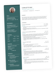
Quick Answer: The best fonts to use in a professional resume are Lato, Arial, Rubik, Calibri, Bitter, and PT Serif. Choosing the right font can help you grab attention, increase readability, and leave a positive impression on recruiters. It's important to choose a font size and weight that are readable and combine two complementary fonts for a clear visual hierarchy on the page.
Looking for a resume writing trick that puts you ahead of the competition?
Use a better font when making your resume.
Professional fonts that meet industry standards will appeal to applicant tracking systems (ATS) and help you get past the screening phase. But they're also key for capturing hiring managers' interest and keeping them excited to learn more about you.
In this guide we'll share with you the best resume fonts to use and why font choice matters. You'll also learn how wrong font size can affect readability, along with other mistakes that you must avoid.
So let's jump right in…
That’s the big question, right?
Finding the right answer involves considering several factors like readability, consistency, and what's suitable for your specific industry and role. Making a positive impression on potential employers is crucial, so choosing the right font can make your resume pop.
Go for typefaces that are simple, elegant, and commonly used, such as Arial, Calibri, Times New Roman, or Rubik. They help you organize and present information neatly and clearly. Traditional fonts like Times New Roman are ideal for conservative fields, while modern fonts like Arial or Rubik are better suited for creative industries.
Ensure the font is easy to read, both on screen and in print, and stick to a size between 10 and 12 points for legibility. Also, maintain the same font throughout your resume to keep it looking professional.
The right typeface can take your resume from bad to great . And that's more than enough to help you get an interview and land a job at your dream company.
After all, the best resume fonts are designed to maximize your chances of getting noticed. They'll help you stand out by simply not making the recruiter squint.
Here are our top 6 picks for professional fonts to use in a resume:
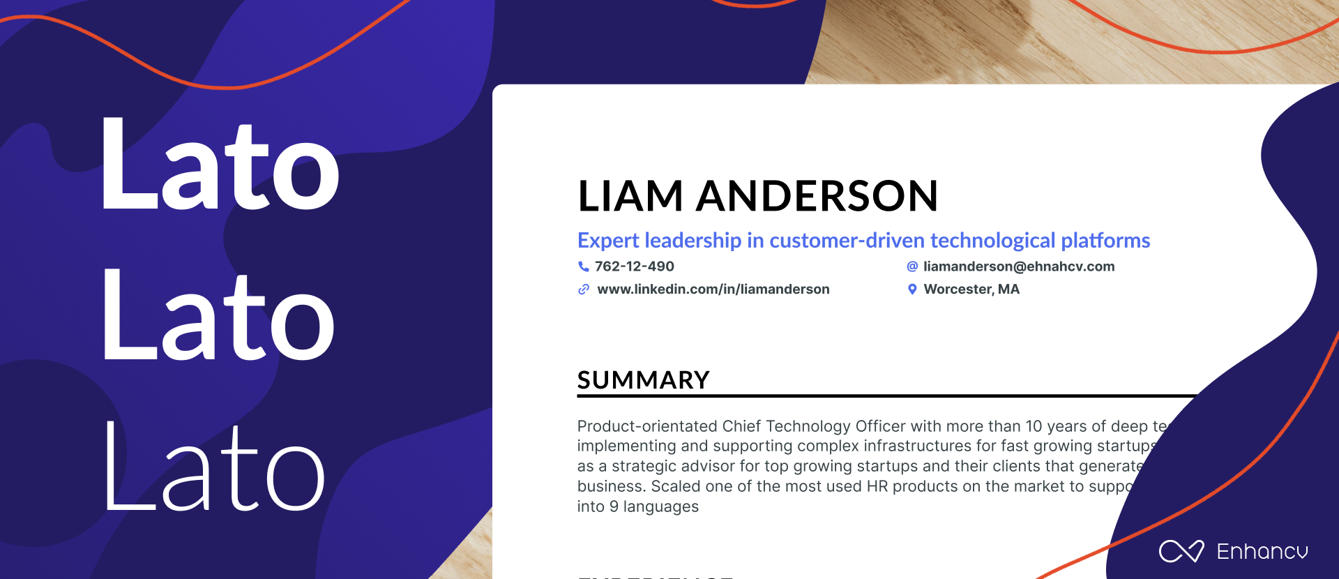
Lato is a typeface created in 2010 that has a sleek, sans-serif look. It doesn't follow much of the current trends. But, it’s still one of the best fonts as it has a modern look that can make a strong impression.
With all its original traits, Lato does an amazing job conveying harmony and elegance. It's a professional font that works both for print and digital resumes , which makes it the perfect design option for your next CV.
If you're looking for a serious but friendly typeface that works for body texts and headlines in uppercase and lowercase, Lato is your best bet.
- Download Lato for free.
- Want another font similar to Lato? Roboto might be a good option.
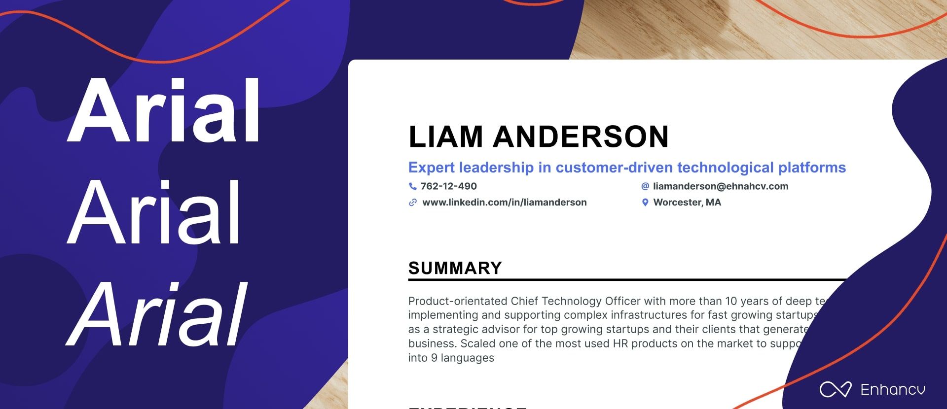
Arial is a sans-serif font that’s neat, clean, and easy to read. It’s a professional typeface that gets the job done by making you look like a serious candidate.
The problem with Arial is that it's an old font that was designed in the early 1980s. So, recruiters might find it tedious and repetitive since many other applicants will probably be using it too.
- Download Arial for free.
- Looking for a modern alternative to Arial? You may also try Poppins for free.
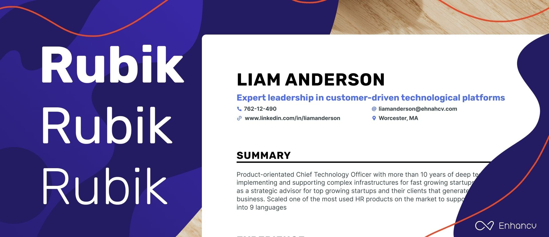
Rubik is a free sans-serif font family designed in 2015. The variety of font weights with bold and italics that it comes with has made it one of the most downloaded typefaces on the internet.
With its slightly rounded corners, Rubik finds the perfect balance between professionalism and friendliness. It works well both for long paragraphs and subheadings, which makes it the ideal choice if you want to stick to only one font in your resume.
- Download Rubik for free.
- Would you like to add a bit of personality to your resume? Try pairing this font with Merriweather .
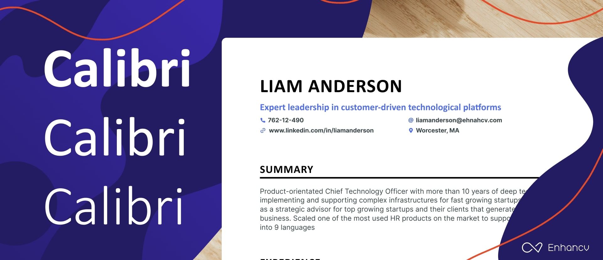
Calibri is a relatively modern sans serif typeface released by Microsoft in 2007. It's the default typeface for Microsoft Word with a font family that consists of thin, regular, and bold.
On one end, this resume font is a safe option because it's new and was developed by a large corporation. But on the other, it might have an overused font style that can turn headhunters off before they start reading.
- Download Calibri for free.
- Need an expressive font that reflects both friendliness and proficiency simultaneously? Open Sans was designed just for that.
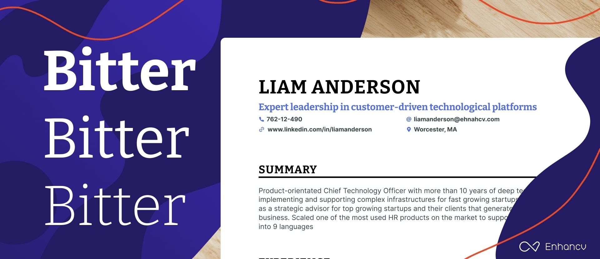
Bitter is yet another free typeface you can use in your resume design . It's a slab serif font that prioritizes on-screen legibility and can work on any computer or device.
The robust letter design guarantees a maximum level of readability. The font family offers a wide range of weights from thin to black, in addition to other formatting options including normal, italic, and bold.
Planning on printing physical copies of your resume?
Use Bitter for headlines and another sans-serif font for long texts. This can be an excellent way to embellish your CV and make it more captivating.
- Download Bitter for free.
- Want a lookalike typeface that improves your resume? Oswald will surely add a dash of creativity to your resume.
Times New Roman
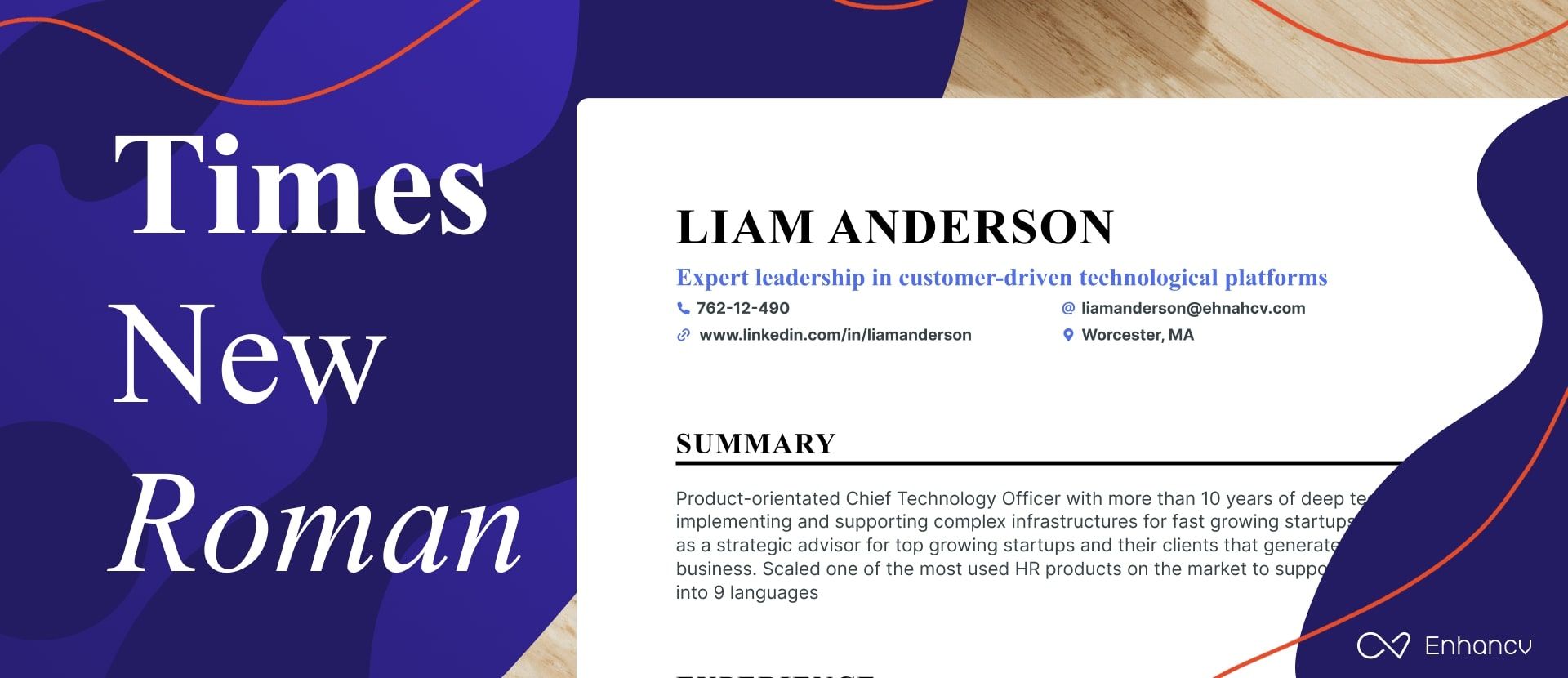
Times New Roman is the oldest font family in this list as it was created in the early 1930s. Due to the exceptional readability it offers, this typeface was used for print magazines and newspapers by the most popular publications around the world.
The truth is…
Despite its popularity, this may not be the best resume font for you. As an old-fashioned serif typeface, Times New Roman makes your resume look like it was designed using an old template on MS Word.
Besides, there is always the possibility that other candidates with similar layouts may be using Times New Roman too. So that makes it impossible for you to grab attention and leave a lasting impression.
You can easily download the fonts featured in this article and use them to build a resume. As long as you have these typefaces installed on your computer, you can use them with any software.
Here’s a short guide by Microsoft on how to add fonts to Windows in a few simple steps . For Mac users, here’s a different guide that will teach you how to install and validate fonts on Font Book.
Less popular, but still great resume font options
If you're thinking about trying different fonts for your resume, we've got some interesting serif and sans-serif options for you. First, let's look at the serif fonts.
Serif fonts are easily recognizable by the small lines or extra strokes at the ends of their letters, giving them a classic and professional look. Because of their excellent readability and formal appearance, they are often chosen for resumes, especially in fields that value tradition and neat presentation like law, research, academia.
Our first suggestion is Garamond . It’s famous for its elegant and timeless appearance, conveying a sense of sophistication and professionalism that makes it a classic choice.
In case you’re looking for a typeface that is easy to read on screens, Georgia is the best option for you, because it features sturdy structures and enough letter spacing.
Another great option for digital readability is Cambria , part of Microsoft’s ClearType Font Collection, optimized for clarity on computer monitors, whether on-screen or in print. Next up is Palatino , a font that stands out with its big x-height and wide proportions. It's both friendly and authoritative, making it perfect for corporate and creative environments.
For those in creative industries, Didot might be perfect, frequently used in fashion magazines. Characterized by its dramatic transitions between thin and thick strokes and distinctive hairlines, it embodies elegance and style.
Meanwhile, Merriweather is a font that balances traditional readability with a modern, open appearance, making it suitable for both web and print.
Lastly, if you're involved in screen-writing, consider Courier , designed to mimic typewritten text with monospaced, clear-cut letterforms, providing a unique retro feel.
Now let's explore some popular sans-serif fonts ideal for resumes.
Starting with Helvetica , this font is chosen for its clean and straightforward style, making it extremely flexible for any type of text.
Verdana is excellent for ensuring your resume is easy to read, with its wide letters and clear layout, especially on digital screens when submitting online applications. Tahoma , similar to Verdana, has tighter letter spacing which works well for creating compact and professional-looking documents such as cover letters and resumes .
Trebuchet MS , another font with a robust feel to it, adds a bit of personality with its slight quirks, while still maintaining an authoritative tone, ideal for both print and digital.
Moving on to Avenir Next , its sleek, modern look is perfect for giving your resume a contemporary edge, suitable for modern industries. For a warmer and more personable approach, Fira Sans is ideal for creative fields that value a friendly tone.
If you're looking to give your resume a modern edge, consider Montserrat . Its sleek, geometric lines ensure it stands out from the crowd. Meanwhile, Open Sans focuses on clarity and subtlety, keeping the attention on your achievements. For tech resumes, Roboto is a great choice as it combines a clean look with just the right amount of friendliness.
Lastly, Impact , true to its name, is best used for headings and titles to draw attention to key sections within your resume . Consider pairing it with some of the fonts mentioned earlier to create a dynamic and interesting layout that makes a strong impression.
Everything you put in your resume affects your application in one way or another, from the layout you choose to the colors and fonts you use.
Now don't get this wrong…
Font choice won't prove that you are experienced or well-qualified for the job. But it does have a huge effect on how recruiters see your resume and interact with it.
Here's why choosing a great resume font for your resume is vital:
A good font helps grab the recruiters’ attention
Six seconds is what it takes recruiters to decide whether or not they should read your resume.
Now let's face it – the font you choose will take up most of the page compared to other design elements . So it's usually the first thing that recruiters notice as soon as they pick up your resume. That's why even color and layout don't affect first impressions as much as font does.
Your resume typeface mainly impacts your personal brand. Resumes with well-chosen fonts are more attractive to headhunters because they're unique. On the contrary, an old typeface can push away recruiters just because it's overused and outdated.
A good font increases the readability of your resume
Using unique fonts to get hiring managers to notice you is one thing — but keeping them glued to your resume is another. After all, recruiters won't hire you just because your resume is beautiful but because you're qualified for the job.
Thankfully, professional fonts are all about clarity and maximum readability. If you take a close look at how typefaces have evolved over the years, you'll notice that the most popular fonts today are simple and easy to read.
To put it in simple terms – a good font will make it easier for headhunters to keep reading even if your sentences or paragraphs are long.
Fonts can help you leave a good first impression
Font choice also has a huge effect on what recruiters think about you after reading your resume.
When the competition is tough, a bad font can get you ignored…
No headhunter is willing to waste ten minutes on an illegible resume while they have 200 other ones waiting in their inbox. But even if they do, they'll be less likely to give you a fair chance after the negative experience they just had.
On the contrary, the outstanding resume font you used will be a way to leave a memorable impression after you're shortlisted. A beautiful resume can keep you on top of the recruiter's mind and get them excited about your application.
First you need to know that font choice can significantly impact how much information you fit on a page. For instance, serif fonts like Times New Roman are usually more compact, allowing you to squeeze more words per line compared to wider sans-serif fonts like Arial.
Plus, you can't forget about the x-height. Higher x-heights, like those in Verdana, allow you to reduce the font size a bit while keeping everything readable, so you can pack more into your resume without it feeling squeezed.
However, fitting more words on the page is just part of the story. The clarity of the font at these smaller sizes is crucial. For instance, fonts like Calibri are designed to be clear even at smaller sizes, which means your resume remains easy to read and doesn't look overcrowded.
This brings us to an important choice regarding whether to use serif or sans serif typefaces in your resume.
Serif vs. sans serif – which typeface should you use in your resume?
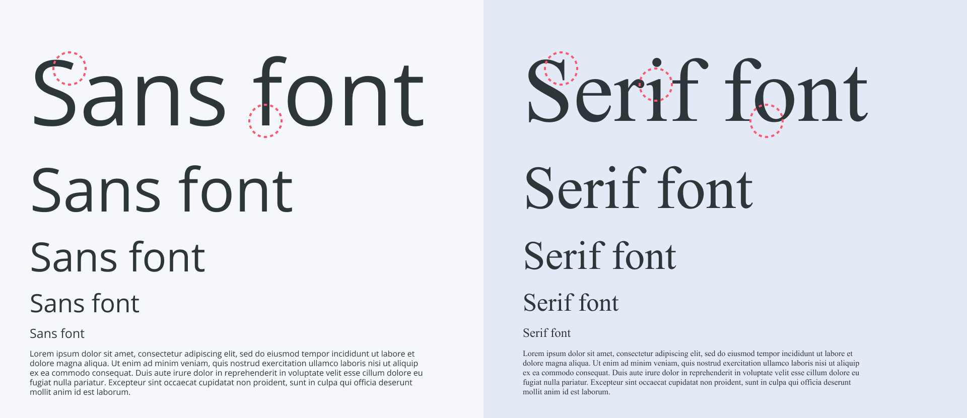
A typeface can either be serif or sans serif. Both styles are professional and popular, and there are pros and cons on each end. The main difference between the two is the decorative strokes at the end of each letterform for serif fonts.
Serif is a classic type of font that gives off a traditional vibe because it was the main typeface in the past century. Due to the decreased eligibility, however, serif fonts are better used mainly for headlines or short sentences to further embellish your resume.
On the flip side – sans serif is all about practicality as it puts readability first by being minimalistic and modern. That makes it the perfect choice for anyone designing a resume that they want to print and use online at the same time.
It's important to remember that choosing to use serif or sans-serif in your resume also depends on your industry.
For example, you might want to use a serif font if you're applying for a job in traditional industries such as law , finance , and education . In more innovative fields, however, you have to build a modern resume that shows creativity and personality. Thus, using sans-serif fonts becomes your best choice.
Can you use a script font in a resume?
Using a script font in a resume is not recommended. It looks beautiful with its flowing, cursive-like design, but it can be a real headache for recruiters who need to quickly scan through resumes to pick out important details. Also, it may not be processed accurately by Applicant Tracking Systems that many companies use to filter resumes. These systems scan your resume for key information, but if they can’t decipher the letters due to the fancy script, important details might not get recorded. This could lead to your resume being overlooked right from the start, regardless of your qualifications.
When creating your resume, pick fonts that are easy to read so employers can quickly find important information. Opting for traditional serif fonts like Times New Roman, or clean sans-serif fonts such as Rubik or Lato, is a smart decision. These fonts guarantee a professional appearance no matter the industry.
Combine two fonts in your resume for a more custom look
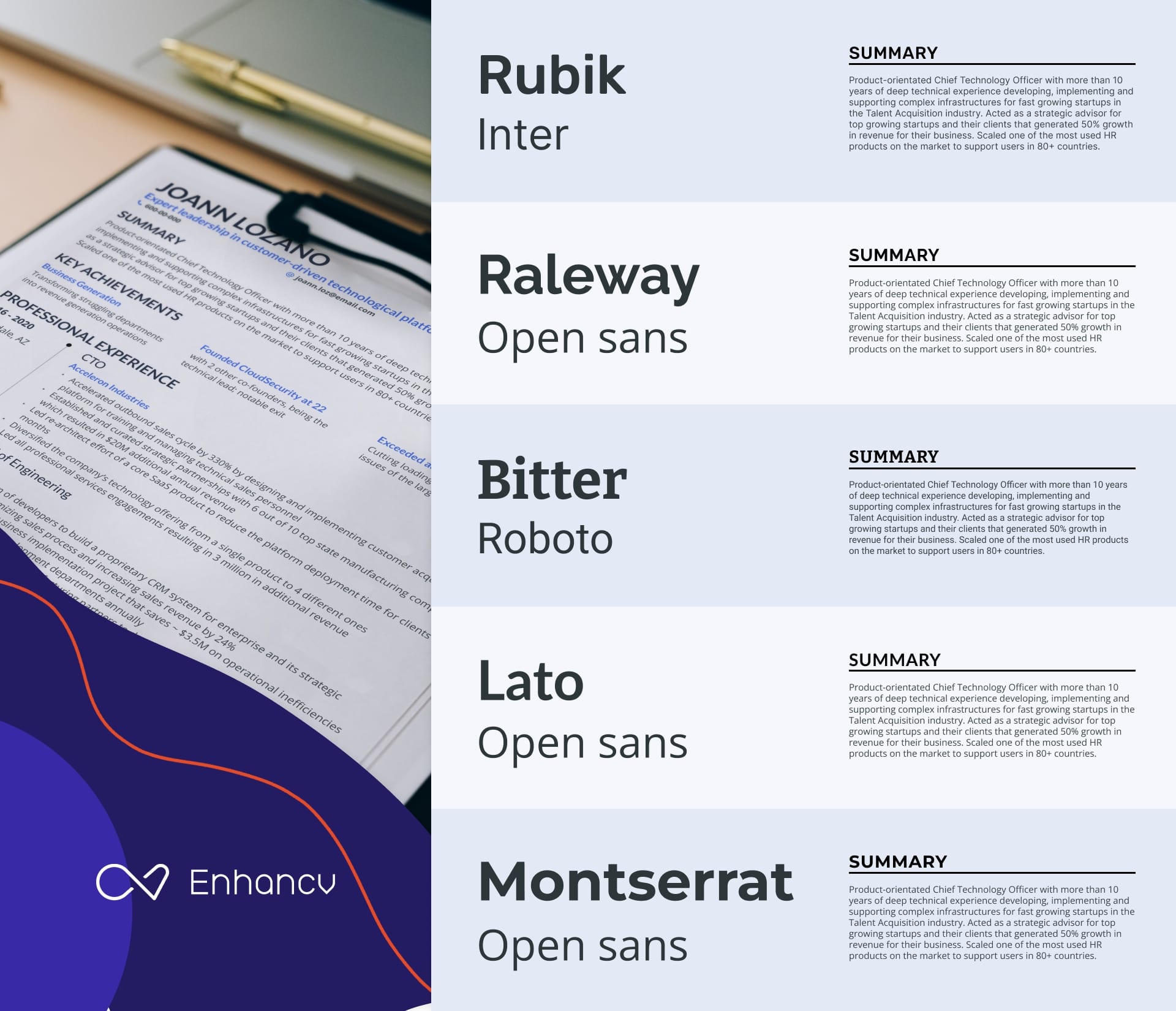
The two fonts will only work if they're well fit to complete each other. Having two dominant typefaces on the same page will create so much conflict as they'll fight each other for attention.
One of the best ways to improve how your resume looks is to use two complementary fonts. This allows you to lead the reader's eye more easily and establish a clear visual hierarchy on the page. To achieve this, choose modern yet professional typefaces that complement each other without being too similar.
Choose both a primary and secondary font that are modern-looking for your resume. And remember, it’s best to avoid overly fancy fonts that might turn recruiters away.
It's a good idea to pick resume fonts that differ in style, making them easy to tell apart at a glance. Using fonts that are too similar can lead to confusion and make your resume harder to follow.
Now let's discuss why the font pairs shown above are effective at capturing recruiters' attention on your resume.
- Rubik & Inter : A great mix where Rubik brings a friendly, rounded feel, and Inter ensures clarity on screens. This duo makes your resume inviting yet professional—perfect for both print and digital.
- Raleway & Open Sans : Elegant and clear, Raleway offers modern, distinctive style, while Open Sans keeps things straightforward and readable. This pairing adds a subtle flair, making your resume stylish yet focused.
- Bitter & Roboto : Ideal for a balanced resume, Bitter adds formality with its condensed serif look, great for headings. Roboto complements this by simplifying the body text, combining professionalism with a welcoming tone.
- Lato & Open Sans : Lato's semi-rounded design emits warmth, suited for approachable headers, while Open Sans maintains simplicity and readability. Together, they craft a resume that’s friendly, professional, and clear.
- Montserrat & Open Sans : Montserrat's geometric style stands out in headers, with Open Sans providing clear readability for the main text. This combination ensures your resume is modern, appealing, and easy to navigate.
Ready to make an impressive resume with these font pairings? Start now with Enhancv's intuitive resume builder and bring your dream job to life! 👇
Get your resume score!
Drop your resume here or choose a file . PDF & DOCX only. Max 2MB file size.
Adjust the font size of your resume
The ideal font height differs based on the length of your resume and the content you're adding.
The standard font size for resumes is 12pt, but it can go slightly up or down to allow you to fit all sections into a single page. Now be careful as anything below 10pt becomes impossible to read — whereas a text size larger than 14pt may be annoying as it slows down the reading speed.
It's essential to have a different resume font size for each element depending on its importance on the page. And you have to be consistent with these choices throughout your whole resume.
For the resume header, your full name should come in the largest font. Your job title follows with a lower size as it is the second most important element. The rest of the contact details should match the default font size in other sections.
Your resume headings must be slightly larger and thicker so that they can stand out easily. The remainder of your resume sections, paragraphs, and sentences should come in a fixed size of around 12pt.
Choose a readable font weight
Size isn't the only thing affecting readability when it comes to typefaces. The weight of your resume font can also make or break your job application.
How is that possible?
Recruiters will struggle to read any resume that comes in a light font weight even when the size is perfect. By the same token, using a bold font weight for paragraphs will only make your page look dense and decrease legibility.
Here's a much better solution…
If you're looking to make certain elements on the page stand out, you're better off using a regular font weight. You'll then be able to create contrast by bolding specific words on the page or using a different color to draw attention.
Font plays an important role when it comes to building a resume that can help you land your dream job. Because of the huge effect it has on first impressions and readability, picking the wrong typeface can be a sure way to get yourself ignored.
This article features the best serif and sans-serif fonts you can use to build a job-winning CV. Combine that with additional tips shared at the end, and you'll create a stellar CV that's guaranteed to make you the center of attention.
Having a hard time creating a resume using the right fonts?
Enhancv builder is here to put your mind at ease… You no longer have to worry about font size, color, page layout, or any other technical details. Our CV builder is an easy-to-use tool that will save you time and help you get hired.
Are there any other fonts you like to use for your resume that we haven’t mentioned? Let us know in the comments below!
- Resume Guides
214 Unique Action Verbs to Power Up Your Resume
How to answer "are you a risk taker" interview question, phone interviews: sure-fire advice on 14 common questions (plus 5 questions to ask the interviewer), what to write instead of "to whom it may concern", should you bring a cover letter to an interview, do you print a resume double sided.
- Create Resume
- Terms of Service
- Privacy Policy
- Cookie Preferences
- Resume Examples
- Resume Templates
- AI Resume Builder
- Resume Summary Generator
- Resume Formats
- Resume Checker
- Resume Skills
- How to Write a Resume
- Modern Resume Templates
- Simple Resume Templates
- Cover Letter Builder
- Cover Letter Examples
- Cover Letter Templates
- Cover Letter Formats
- How to Write a Cover Letter
- Cover Letter Guides
- Job Interview Guides
- Job Interview Questions
- Career Resources
- Meet our customers
- Career resources
- English (UK)
- French (FR)
- German (DE)
- Spanish (ES)
- Swedish (SE)
© 2024 . All rights reserved.
Made with love by people who care.
10 Best Resume Fonts to Use in 2022
- Resume Writing Tips
Writing your resume can be tedious and challenging. Making sure it conveys your feats and credentials in the best way to market yourself well takes effort and time. Further, its look and format also play a major role in your overall application. Part of proper resume formatting involves choosing the best resume fonts to use. It helps your text be more readable, striking, and simply stand out. Yet, it’s also vital to know that fonts you use can make or break your resume. Of course, you wouldn’t want to let yours end up in the discard pile, right?
That said, you should know why you must format your resume properly using the best fonts.

Importance of Formatting Your Resume
Each day, recruiters and hiring managers receive hundreds or even thousands of job applications. A 2018 study from The Ladders found that hiring managers spend an average of 7.4 seconds to screen resumes. They spend this time to decide whether an applicant is fit for a role. So, every detail of your resume counts.
As a job seeker, you must prepare to beat the system. Since hiring managers spend less than 10 seconds looking at each resume, make sure that yours evokes a sense of style, professionalism, and uniqueness. Your resume font choice is a great way. Further, since most job applications now are being done online, you need to optimize your resume in such a way that it’s easy to be read onscreen.
On another note, here are some top formatting points to note regarding resume fonts:
- Resume font size: The optimal size is at 10 to 12 points for normal text and 14 to 16 points for section titles and headers.
- Proper use of italics and boldface: Bold text is great if you want to draw attention to certain words. Bolding can help your subtitles stand out without enlarging them. Italics helps in supporting texts.
Types of Fonts
There are thousands of unique fonts, each with certain characteristics. The four major types of fonts are serif, sans serif, script, and decorative.
Since we’re talking about a professional document you will use to market your feats before a hiring manager, we’ll focus on the serif or sans serif font types to use in writing your resume. These will help make your resume more legible and attention-grabbing!
Best Resume Fonts to Use
Two of the most commonly used fonts are Arial and Times New Roman. While they don’t belong to the “forbidden fonts,” we won’t include them as the best fonts for resume to use for 2021. Arial tends to be overused and doesn’t help make formal files such as a resume stand out. Times New Roman, on the other hand, may be too compact which makes it harder to read.
While other job seekers want to get creative with their font choice, you must be keen on what to use. For instance, Comic Sans may not be a good font since it doesn’t help you add professionalism in your resume.
That said, our team of career experts compiled a list of the best resume fonts you may choose from this 2021.

Typographer Luc(as) De Groot designed the Calibri font family as commissioned by Microsoft in 2002. The default typeface in various MS apps, Calibri is known to be a humanist sans serif typeface for its warmth and rounded lines.
Further, the font’s nature fits well with the modern age and even in the shift in business practices across the globe. It reflects the flexibility and open-mindedness of the new digital age.

Created specifically to address the challenges of onscreen display, Verdana was designed by type designer Matthew Carter. Also, the sans serif font was hand-hinted by leading hinting expert Tom Rickner.
The font’s generous width and spacing allows for its legibility on screen. This is one of the best resume fonts to use for your applications done online, which require digital versions of your resume.
3. Book Antiqua

Designed by Monotype Type Drawing Office, this serif font is a roman typeface based on pen-drawn letters of the Italian Renaissance. Due to its distinct and gentle appearance, Book Antiqua can be used to give your resume a unique feel than is given by other geometrical designs of most typefaces.
Further, this can be used in occasional lines such as letter headings.
4. Palatino Linotype

Named after Giambattista Palatino, a master Italian calligrapher, this font is designed by Hermann Zapf in 1948.
Palatino was originally punchcut in metal, but was quickly adapted for use with the Linotype machine. Based on the humanistic serif designs of the Renaissance, this font is easier to read. Its strokes are lighter and its proportions are relatively larger than smaller Renaissance letters. So, if you’re opting for a more formal design for your resume, you can’t go wrong with Palatino.

Designed by Monotype Imaging and Tiro Typeworks and commissioned by Microsoft, Cambria is also one of the best fonts for resume. Another font designed for on-screen reading and better readability even in small sizes, Cambria has very even spacing and proportions.
As a serif typeface, this is works best for body text, readable even when printed small or displayed on a low-resolution screen.

Georgia is one of the best serif typefaces to use in your resume. Another design by Matthew Carter, this font is resonant with typographic personality. This typeface family combines high legibility and charm.
Also, Georgia is inspired by the need for clarity at low resolutions on the screen.
7. Garamond

Created by Robert Slimbach, the Adobe Garamond serif face was released in 1989. This is known as one of the most versatile fonts available today. Also, it’s one of the most pleasing and graceful in print.
This font family is based upon the typefaces first created by the famed French printer Claude Garamond in the 16 th century.
8. Trebuchet MS

Another humanist sans serif, this font was designed by Vincent Connare in 1996. It’s also made for screens. Connare wanted to instill personality into the letterforms, even at small sizes, while retaining clarity and readability.
This font is well-suited for long texts, which can be applied to writing your summary of experiences in your resume.

One of the modern yet professional options is Didot. It’s a group of typefaces named after the French printing and type producing Didot family. Firmin Didot cut the letters, and cast them as type in Paris.
10. Avenir Next

Last of the best fonts for resume on this list is Avenir Next. While this may seem like an uncommon option, this font is a new take on a classic face. The font family’s design is clean, straightforward, and works best for blocks of text and headlines as well.
With all these great options of font styles to use in your resume, you can make it work better for you in your job search journey.
Having a Hard Time Writing Your Resume?
Lastly, we all know job search involves a lot of aspects to focus on. To succeed, you need to allot more time, effort, and resources to secure a worthwhile career. For most job seekers, this can be a lot to handle.
Good thing is that there are experts who can help you get the tiresome task of resume writing off of your list! Our topnotch team offers resume writing services to ensure you’re equipped with a compelling one. What are you waiting for? Contact us today to know more!
You may also try our resume builder if you want to write on your own!
Recent Post

Innovative Career Development Tools: Empowering Employee Growth in the Digital Age

Examples of Job Postings on LinkedIn: A Comprehensive Guide for Job Seekers

Warehouse Resume Objective Examples: Stand Out in Your Job Search
Elevate your career in a click.
Be on top of the job search game. With our expert writers and easy process, you’ll get excellent results. Optimize your resume now!
Related Post

FBI Federal Resume Template: A Comprehensive Guide with Examples
- 1-510-740-4155
- +91 78278 33397
- [email protected]

- TALK TO OUR CONSULTANTS +91 78278 33397
What is the Best Font for a Resume?
- Rahul Ranjan
- September 28, 2021
- One Comment
How can your resume ultimately land on the recruiter’s table? This would be the main goal as you begin your resume writing process.
Grabbing the full attention of the recruiter in a matter of only 10-20 seconds is a matter of presentation. Only a well- presented and impressive resume will be put forward in the process of selection. Nevertheless, the readability and professionalism not to be compromised
Here are few ways how you can design the best professional resume:
How Do You Choose the Best Fonts For A Resume ?
With so many options, you might feel a little overwhelmed to decide on which font gives the best impression to the recruiter.
You should also keep in mind that if it is difficult for the recruiter to read the resume, they might just put it off and reject it. Numerous software also assists in this case like the ATS system , also known as Applicant Tracking System. It helps to sort and record the job applications. These programs also interpret with the fonts to sort out the job applications. Those illegible or those which cannot be read turns them into black boxes or illegible characters.
As you know, different resumes require different kinds and levels of creativity. A graphic designer or other such creative fields require a creative resume that showcases the levels of creativity in the person. However, making sure that the resume is also not very overly done and readability is its top priority.
Top 10 Best Fonts For A Resume
Calibri: The modern and soft font, which is also the default font for many email programs. It is also the most familiar to the eye font.
- Times new roman: Most of the corporate, operations, and legal aspects accept this as the font. It is the most electronically readable font.
- Arial: Most preferred on the creative field aspects, also greatly preferred in the marketing field.
- Verdana: Greatly preferred for its modern touch and also good readability for its gentle wider spacing.
- Cambria: It is just another formal, default-type font that most recruiters are familiar with.
- Garamond: Gently inclined towards more on the artistic side, it is more suited for the artist peers.
- Book antique: It works well with the professionals that are more inclined towards subjects like arts and humanities.
- Trebuchet MS: The round and creative, modern font is most suited for the creatives and marketing fields.
- Arial narrow: This sans serif is the most modern and consumes less spacing, thereby also being legible.
- Didot: This stylish and readable format is artistic yet professional at the same time.
What Is the best font size for a resume?
The most preferred best font size for a resume is anywhere between 10 to 12. The resume font layout has a great impact on your layout and the overall resume. Since the resume has to be kept one page, therefore it is greatly preferred to keep it in the size 10. Also, you must avoid making your resume below the font size of 10. It might make it difficult to read a document for the recruiter.
Also, be very specific while writing the resume, as you have to make it under one page itself. Therefore, if it is two pages or longer then try to make it under one page by keeping it in 10 point format and removing all the unnecessary data and phrases. Only highlight the most relevant context in your resume and maintain the overall consistency.
What are the other things to consider while resume writing?
- Easy to read font: Always remember to use a clean and simple format to encourage the employers to look at it. Make use of clear words and avoid using complex fonts and sentences. Here, you can use sans serif fonts which are good for readability and also simple yet professional. It might include fonts like Times New Roman, Cambria, etc.
- Avoid light fonts : While writing a resume focus on readability. avoid overly designed formats, thin and light formats which might be difficult for the employer to read.
- Resume font style : Style up your resume by adding bold letters, underlining it, and italicizing it. You can add up the different fonts to highlight important sections like education and experiences etc.
Mentioned above are a few ways to style up and choose the best font for your resume.
To design the best readable and styled resume for yourself, you can contact Writrox , here, our professionals will help you do your best with the Resume Writing Services that you are putting forward for your dream job.
Related Articles

10 Tips for Building a Strong LinkedIn Network
Is Copying Someone’s Resume Right?
7 Reasons Why You Are Facing Resume Rejections
Leave a comment cancel reply.
Your email address will not be published. Required fields are marked *
Save my name, email, and website in this browser for the next time I comment.
Table of Contents

How LinkedIn Branding Drives Business Profit?
Executive Resume Writing Trends in 2024
LinkedIn Pages vs. LinkedIn Profiles

Thanks for reading the blog; We hope you enjoyed it.
To have your resume and profile written by our expert writers.
REQUEST A CALL BACK
- I agree to receive call from writrox team
- Sub Cat Link
The Best and Worst Fonts for Resumes (and Font Sizes)

Have you ever found yourself wanting your resume to be absolutely perfect to increase your chances at earning an interview with your dream employer?
No doubt you spent hours making sure the substantive content of your resume aligned with the job itself, such as including keywords from the job description , blending soft and hard skills , and making sure your work experience tells the proper career story .
But what about the appearance of your resume? Have you considered that there are certain fonts and sizes you should (and should not) utilize to further increase your success rate? If not, you may want to review the following best and worst fonts and sizes for your resume.
The Top Three Resume Fonts
There was a time when Times New Roman was Microsoft Word’s default font. But if you boot up the application now, you will see that Calibri owns that honor. Calibri is a modern, refined, and professional font that reads well. It is also a sans-serif font , which renders out more clearly on a screen, thereby increasing legibility.
Cambria is another popular and professional-looking font. Though it is a serif font, it was specifically designed to perform well on-screen and look good when printed out.
3. Garamond
For many, Times New Roman is the default – which is exactly why you should avoid it. Garamond is a great alternative. Not only does it provide a classic, polished look, but it also helps fit more text on a page without compromising readability.
The Three Worst Resume Fonts
Right away you should be able to tell why you should avoid this font at all costs. It is bold, which makes for a better personality trait than font. Keep this one off your resume.
2. Lucida Console
As you can tell, this font has a fixed width, which makes it appear boxy and computer-like. Even if your resume will be read on a screen, there are much better alternatives to this one.
3. Times New Roman
In all fairness, there are many fonts worse than Times New Roman. You could scroll through Word’s options and find a host of terrible fonts ill-suited for resumes. But the point here is to emphasize commonly used fonts that you should not be using. And as previously stated, Times New Roman is overly used and not unique, which will work against your efforts to stand out.
Let’s Talk Font Sizes
Once you have picked the right font, your next thought should be how big or small to make the font size.
The simple and straightforward answer is this: the best resume font sizes are 11 to 12 for normal text and 14-16 for section titles and headers.
You may be tempted to use smaller font sizes so you can fit all of your content onto a single page. Do not do that. Instead, experiment with font types or limiting content before resorting to smaller font sizes.
Are you looking for your dream job? See who is hiring at CyberCoders.com .
Looking for jobs hiring?
Thousands of full-time and remote jobs in every industry. Search jobs.
Are you hiring for your team?
We'll find you the right candidate, fast. Get started.
Want to join our team?
Our recruiters connect people with great opportunities and help our clients build amazing teams. Learn more.
Recent Articles

- Browse Jobs
- Browse Skills
- Browse Locations
Upgrade your career
Submit your application, login to cybercoders, personalized job alerts, 10 applies with 1 click.
Best Resume Font Size for 2023
Best font for resume, what is the best resume font size to use in 2023, other resume fonts you can use (zety), frequently asked questions (faq), what size font should your name be on a resume, why you shouldn’t use a large variety of fonts, does font matter on a resume.
“ Recruiters spend 5 to 7 seconds on average going over resumes . 76% of the resumes are rejected due to an unprofessional email address. 88% of the resumes are rejected due to a picture on the resume.: — Writrox
Wrapping Up | Resume Font Size
Similar posts, what to write in an email when sending a resume, guide to resume margins in 2023, 5 best federal resume writing services for 2023, harry potter’s resume, 7 resume myths to stop believing (infographic), what is relevant experience resume advice for 2023.
Press Herald
Account Subscription: ACTIVE
Questions about your account? Our customer service team can be reached at [email protected] during business hours at (207) 791-6000 .
- Arts & Entertainment
A new book shines light on a largely forgotten group of female printmakers
'Trailblazing Women Printmakers: Virginia Lee Burton Demetrios and the Folly Cove Designers' reexamines a collective of talented printmakers who operated in Massachusetts in the mid-20th century.

You are able to gift 5 more articles this month.
Anyone can access the link you share with no account required. Learn more .
With a Press Herald subscription, you can gift 5 articles each month.
It looks like you do not have any active subscriptions. To get one, go to the subscriptions page .
Loading....
They were an artists’ collective led by a woman with a membership made up almost entirely of women. Focused on printmaking, they worked at the intersection of immigration, the creative economy and entrepreneurship, all while facing headwinds in a world of gendered work.
The Folly Cove Designers were a successful community in Rockport, Massachusetts, that, between 1941 and 1969, designed images on linoleum panels and imprinted them on fabric. They were led by Virginia Lee Demetrios, an accomplished artist who was also an exceptionally effective teacher.
Local review
“Trailblazing Women Printmakers: Virginia Lee Burton Demetrios and the Folly Cove Designers”
By Elena M. Sarni
Princeton Architectural Press
Largely forgotten today, they remain important because of their artistic creativity, their commitment to their art form and the beautiful work they create. A new book by South Berwick author Elena Sarni is poised to bring them renewed attention.
“Trailblazing Women Printmakers: Virginia Lee Burton Demetrios and the Folly Cove Designers,” is intended to “celebrate the group’s incredible artistry, document their achievements, and introduce a new audience to their work,” Sarni writes. She makes a convincing case.
Sarni’s interest in the Folly Cove Designers dates to 2006, when she was an assistant curator at the Cape Ann Museum in Gloucester, Massachusetts. Over the intervening years, she extensively researched the collective and unearthed previously “lost” designs.
Virginia Lee Demetrios was a powerhouse. In 1928, she moved from California to Boston to care for her father. In Boston, she worked as an illustrator for the Boston Evening Transcript, enrolled in the Boston Museum School, and met the man who would become her husband, George Demetrios. Advertisement
Virginia and George moved to the Folly Cove community of Gloucester, where they lived among descendants of recent immigrants, mostly from Finland. The close-knit environment of the Finnish community proved fertile ground for what would become the Folly Cove Designers.
Virgina raised two children, and by 1939 she had published several children’s books including “Mike Mulligan and His Steam Shovel.” She would go on to publish seven books, among them “The Little House,” which won the Caldicott Medal in 1943.
The printmaking collective’s origin story begins in 1938 with a swap: Virginia offered to teach one of her neighbors how to design block prints if the neighbor would, in exchange, give music lessons to one of Virginia’s children. By 1941, the one-on-one design tutoring had blossomed into a printmaking class with 40 to 50 students; Virginia served as the group’s teacher and leader.
Many of the Folly Cove Designers had no prior experience in art. Virginia outlined a deliberate process for them to follow to develop their artistic skills, including helping some collective members learn how to draw. She began to write a book about her design process, “Design and How!” but she never finished it. Some of the book’s funniest moments come when Sarni quotes from letters sent by Virginia’s eternally patient editor gently imploring her to complete the book: “How can I persuade you that (finishing the book) is your duty, your pleasure and a future source of profit for both of us and our grandchildren?”
The Folly Cove Designers focused on simple designs, often from nature, and required students to consider a subject from many perspectives before converting a design to a linoleum block. For work to become a Folly Cove Design print, it had to go through a juried process to earn the group’s seal of approval.
An article in the Nov. 26, 1946, edition of Life Magazine propelled the Folly Cove Designers into the public eye. At the time, Life Magazine was one of the country’s most widely read publications, and being the subject of a Life Magazine article was public relations gold. The group became more market-aware, for example, changing the name of one piece from “Compost Pile” to “Deciduous.” By 1948, they had trademarked their name and made distribution deals with major retailers of the day, such as Lord & Taylor and Macy’s. Advertisement
But the Folly Cove Designers felt strongly about keeping artistic control of their work even if it meant, as it eventually did, exiting commercial contracting. “A Macy’s representative told Virginia Lee Demetrious that if the group were to sign with Macy’s and let them handle production, she could be driving a Rolls Royce instead of a Ford,” Sarni wrote, “to which she is said to have replied that she liked her Ford.”
During the 1950s and into the 1960s, the Folly Hill Designers focused on art not commercialism, “and their belief (was) that community was at the heart of their enterprise,” Sarni wrote. They continued making art until Virginia’s death in 1969, at which point the collective disbanded. By then, the group had produced over 300 prints and participated in over 15 exhibitions.
This is a gorgeous book that features a generous display of the designer’s often stunningly beautiful work in elegantly designed arrangements. Each image is accompanied by insightful comments from Sarni, whose scholarship and storytelling skills are evident throughout. “Trailblazing Women Printmakers,” which brought me joy every time I picked the volume up, is the tribute that the Folly Cove Designers deserve.
Dave Canarie is an attorney and faculty member at the University of Southern Maine. He lives in South Portland.
Modify your screen name
Join the Conversation
Please sign into your Press Herald account to participate in conversations below. If you do not have an account, you can register or subscribe . Questions? Please see our FAQs .
Your commenting screen name has been updated.
Send questions/comments to the editors.
« Previous
Bestsellers: ‘All Fours,’ ‘The Anxious Generation’
Next »
For one local artist, drawing and cooking are forms of meditation
Freeport antiques dealers forced to leave market following Linda Bean’s death
Police investigating forest avenue shooting search gray residence, medical examiner: one mechanic falls girl died from stabbing; sister died from multiple injuries, start of beach to beacon 10k delayed by 1 hour, u.s. transportation secretary pete buttigieg will visit maine next week.

- Instructions - December 2022
- Games - November 2022
- Decisions - October 2022
- Borrowed - September 2022
- Up all night - August 2022
- First Impressions - July 2022
- Broke - June 2022
- Guests - May 2022
- Grit - April 2022
- Mischief - March 2022
- Quitting - February 2022
- New Kid - January 2022
- Overheard - December 2021
- Ghosts - November 2021
- Old Friends - October 2021
- Hometown - September 2021
- Moving Day - August 2021
- Keepsakes - July 2021
- Mistakes - June 2021
- Siblings - May 2021
- Gardens - April 2021
- Haircut - March 2021
- Rural Life - February 2021
- Silver Linings - January 2021
- Surprise - December 2020
- Reunion - November 2020
- The Attic - October 2020
- Locked Out - September 2020
- After The Storm - August 2020
- Inheritance - July 2020
- In The Driver's Seat - June 2020
- The Last Time - May 2020
- Forgive Me - April 2020
- A Fish Out of Water - March 2020
- Let's Go - February 2020
- Ask Your Mother - January 2020
- A Close Call - December 2019
- Second Chance - November 2019
- Best Advice - September 2019
- A Phone Call - August 2019
- Working in Vacationland - July 2019
- Graduation - June 2019
- A Real Mainer - May 2019
- Lost and Found - April 2019
- Now We Can Laugh - March 2019
- A Lesson - February 3, 2019
- Starting Over - January 6, 2019
- Heading Home - December 2, 2018

Member Log In
Please enter your username and password below. Already a subscriber but don't have one? Click here .
Not a subscriber? Click here to see your options

IMAGES
VIDEO
COMMENTS
The following fonts are great to use on a resume: 1. Arial. Arial is a popular sans-serif font that ensures your resume is easy to read. It's one of the most widely available fonts and the default font for Google Docs. Arial is a good choice if you want a clean, no-nonsense look to your resume. 2.
It has a tech look to it, but feel free to use it in any industry - tech or otherwise. Overpass - Relatively newer font, developed in 2015, Overpass is a digital typeface font inspired by Highway Gothic. It looks very formal and classy, making it ideal for more conservative industries.
8/4/2022. JGI/Tom Grill/Getty Images. Writing a resume involves a lot of decision-making. ... What font and font size to use on your resume are decisions that feel like way bigger a deal than they probably should—as anyone who's ever spent 45 minutes agonizing between Arial and Helvetica can attest. The good news is, the choice is ...
2. Select the right resume font size. The optimal font size for your resume is anything between 10 and 12 points. The size you choose can be largely determined by how the font size impacts your resume layout. A one-page resume is appropriate for new graduates or employees new to a field.
Here are the top 10 best resume fonts in 2022. 1. Helvetica. This is a Swiss sans-serif font licensed by Linotype. A lot of professionals rank Helvetica as the most beautiful sans-serif font. Thus, making it the best sans-serif font 2022 as it is sure to divert the recruiter's attention to your resume.
In this article, we will share the best resume fonts, the worst resume fonts, the best font sizes, and the best font colors for 2022. Mike Podesto (Founder & CEO - Find My Profession): Not every resume font is created equal. When it comes to your resume font… stick to the basics! ... Adjusting your resume font size can be crucial to making ...
1. Times New Roman. Times New Roman font has been popular for resumes for decades. This serif option is easy-to-read and communicates formality. Online, the font is uniform and accessible across various platforms and operating systems. Best for: Word documents. PDFs can host unique fonts.
1. Pick a Legible Resume Font Size. Font size impacts not only text legibility but also the emotional response that written words induce. That's why resume font size really matters. Opt for the standard font size for resumes—12 points, as a classic and easily readable font. Larger fonts are good for emphasizing your name and section headings.
The best resume font size is between 11-12 points. This size range allows for the best readability while making it easier to fit all your content onto one page. However, different types of text on your resume can vary in size: Your name (on the contact information): 18-24 points. Resume section headings: 14-16 points.
Helvetica is an excellent sans-serif font you can use for your resume. Helvetica is very similar to Arial and requires close inspection to really tell the difference. It, too, offers a clean and modern look that's easy on the eye. It also comes in a variety of weights and styles. 4.
Here's are some guidelines about the font size to use on your resume: 10 to 11 points - This range is suitable for most resumes. It ensures readability while allowing you to fit a good amount of content on the page. ... January 2020 - December 2022; Jan 2020 - Dec 2022; 01/2020 - 12/2022; Whichever format you choose, be consistent ...
Key Points. In experts' opinion, Calibri is the best font for a resume and a cover letter, too. Comic sans and other script or funky typefaces make the worst fonts. Body text should be 11-12pts, while subsection headings can be 13-16pts. Use bold and italics sparingly to accentuate particular passages.
The best resume font is legible, easy on the eyes and ATS-friendly, such as Arial, Helvetica and Verdana. Avoid fonts like Comic Sans, Lucida Handwriting or custom ones downloaded online. It's best to stick with a 10-12 point size for resume body copy, 14-16 points for section headings, and 18-24 points for your name.
The best sans-serif fonts to use on your resume are Arial, Helvetica, and Gill Sans, while the best serif fonts are Georgia and Garamond. The right font for your resume will look serious and professional, grab the recruiter's attention in the first few seconds, and pass the ATS scan. The best font size for a resume is 10-12 for the body, 12 ...
designed for use on screens and renders well on smaller screens such as mobiles. works well at both header and body copy sizes. Trebuchet is a good resume font choice for jobs in: marketing. fashion. media. entry level jobs where its wider body helps fill up the resume page and its style conveys enthusiasm and energy.
1. Arial. This sans-serif font is often used for branding and website or mobile design, which makes it a great option if you're in the creative field or are applying to a marketing job. 2 ...
Sep 8, 2022 • 16 min read. Quick Answer: The best fonts to use in a professional resume are Lato, Arial, Rubik, Calibri, Bitter, and PT Serif. Choosing the right font can help you grab attention, increase readability, and leave a positive impression on recruiters. It's important to choose a font size and weight that are readable and combine ...
Here's a list of the 10 best resume fonts you must use this 2022! Ensure that your resume is well-formatted and attention-grabbing through your font choice. Here's a list of the 10 best resume fonts you must use this 2022! ... Resume font size: The optimal size is at 10 to 12 points for normal text and 14 to 16 points for section titles and ...
The most preferred best font size for a resume is anywhere between 10 to 12. The resume font layout has a great impact on your layout and the overall resume. Since the resume has to be kept one page, therefore it is greatly preferred to keep it in the size 10.
Once you have picked the right font, your next thought should be how big or small to make the font size. The simple and straightforward answer is this: the best resume font sizes are 11 to 12 for normal text and 14-16 for section titles and headers. You may be tempted to use smaller font sizes so you can fit all of your content onto a single page.
Tags: resume font size, what font should my resume be, resume font, best font for resume 2022, best font for resume 2023, resume type, resume sizing, what's the best font to use for a resume. Author: Reid is a contributor to theJub. He's an employment and marketing enthusiast who studied business before taking on various recruiting ...
The Best Font Size to Use For Your Resume. The best font size to use for normal text are 11-12pt, and 14-16pt for section titles and headers. These font sizes will ensure there is a demarcation ...
Please update your payment information to resume service. ... Font size + Gift article. You are ... October 2022; Borrowed - September 2022; Up all night - August 2022 ...
Font Size. Text Edge Style. Font Family. Defaults Done. Powered by THEOplayer 2023.3.0. France ... Au Tournoi de France 2022, la buteuse avait éteint la Seleção (2-1) d'un doublé plein de ...